Why Japanese Web Design Is So… Different

In the mind’s eye of many people, Japan is a land of tranquil Zen gardens, serene temples, and exquisite tea ceremonies. Both traditional and contemporary Japanese architecture, books and magazines are the envy of designers worldwide. Yet for some reason, practically none of this mastery has been translated into digital products, in particular websites, most of which look like they hail from around 1998.

Exhibit A: Rakuten Ichiba

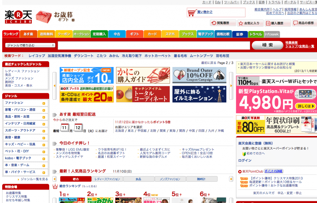
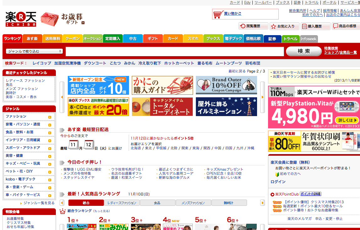
Go on a safari around some of Japan’s most popular sites and here’s what you can expect to find (see Goo, RakutenYomiuriNicoNicoOKWave, @cosme, and more):

  • Dense tightly packed text
  • Tiny low-quality images
  • More columns than you can count
  • Bright clashing colours and flashing banners
  • Overuse of outdated technologies like Flash

A beautiful haiku or minimal wabi-sabi they not. The theories for why this is are numerous and I’ve tried to expand on some of the most prevalent below:

Linguistic Differences

Sir, is that a middle finger ?
Photo by shootjapan.com

Character ComfortLogographic-based languages can contain a lot of meaning in just a few characters. While these characters can look cluttered and confusing to the Western eye, they actually allow Japanese speakers to become comfortable with processing a lot of information in a short period of time/space (the same goes for Chinese).

Lacking Emphasis – Japanese doesn’t have italics or capital letters which limits the opportunities for adding visual punch that you get with Latin alphabets. This makes it more difficult to create the hierarchical contrasts required to organise information with type alone although many designers get around this by adding decoration or using graphic text.

Language Barrier – The web and most of the programming languages which drive it were designed by English speakers or Western corporations and hence the majority of documentation and educational resources are also in English. Although much gets translated this still causes a delay in new technologies and trends being adopted.

Cultural Differences

Salary Man Street

Risk Avoidance – In general Japanese culture does not encourage risk-taking or standing out from the crowd. Once a precedent has been set for things looking or behaving a certain way then everybody follows it, regardless of whether there is a better solution. Even Japanese subcultures conform to their own fashions and rules.

Consumer Behaviour – People require a high degree of assurance, by means of lengthy descriptions and technical specifications, before making a purchasing decision – they are not going to be easily swayed by a catchy headline or a pretty image. The adage “less is more” doesn’t really apply here.

Advertising – Rather than being seen as a tool to enable people Japanese companies often see the web as just another advertising platform to push their message across as loudly as possible. Websites end up being about the maximal concentration of information into the smallest space akin to a pamphlet rather than an interactive tool.

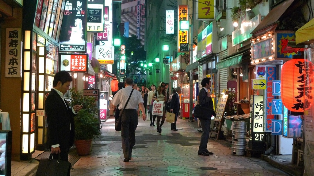
Urban Landscape – Walk around one of Tokyo’s main hubs like Shibuya and you’re constantly bombarded with bright neon advertisements, noisy pachinko parlours (game arcades), and crowds of rambunctious salarymen or school kids. The same chaotic busyness of the streets seems to have spilt over to the web. Added to this, because physical space comes at a premium in Japan, none of it is wasted and the same goes for negative/white space on a webpage.

Job Roles – Look on any job site in Japan and you’ll still see adverts for roles like “Web Master” and “Web Admin” which hark back to the day when a company would employ a single IT guy to hand-code and run their entire website – many still do. On the other side of the equation, creative people want creative freedom which they’re not likely to find in a large Japanese corporation so they go elsewhere.

Technical Differences

[Shibuya] Umbrella Bokeh
Photo by scion_cho

Mobile Legacy – Japan was using their version of the mobile web on advanced flip phones long before the iPhone came along and in even larger numbers than personal computers. Back then the screens were tiny and the way sites had to be designed to cram content into this small space has continued to influence the way things are now.

Web Fonts – There is a lack of web fonts for non-Latin languages (Chinese, Japanese…). This is because each font requires thousands of characters to be individually designed which is prohibitively expensive, time-consuming, and would take longer to download. For these reasons, designers tend to use graphics rather than plain text to display non-standard typefaces.

Windows XP & IE 6 – although the number of people using ancient Microsoft software is rapidly decreasing there are still a fair number of people using these dinosaurs, especially in corporate environments.  Enough said.


Japan - Back to the Future Poster

Walking around Tokyo, I often get the feeling of being stuck in a 1980s vision of the future and in many ways, it’s this contradiction which characterises the design landscape in Japan. On one side we have enormous conglomerates churning out uninspiring mass-produced conformity while on the other side, we see master craftspeople making things of incredible beauty and functionality.

On a more positive note, smaller design firms and companies like UNIQLO, MUJICookPad and Kinokuniya are proving that you can make aesthetically pleasing and functional websites in Japan. Let’s hope the rest learn from them and catch up soon.

More interesting discussion here: one, two, three, four, five.


Update 1: A lot of people have been commenting that much of the above also applies to websites in other regions of Asia so here are a few to look at for comparison –

Update 2: A big welcome to readers from RedditMetaFilter and Smashing Magazine! Unfortunately, all the traffic knocked the site offline for most of Wednesday but things should be stable now. For future updates, you can follow Randomwire on Twitter or Facebook. For any questions or enquiries feel free to get in touch.

Update 3: Some kind folks have translated the article into Japanese, Chinese, VietnameseThaiGermanSpanishItalianArabic and Korean.

Update 4 (10 years later!): A couple of YouTubers have created in-depth videos dissecting some of the technological and cultural arguments above. It’s amazing to see how far this article has travelled and how it seems to still be relevant today.

David avatar

94 responses

  1. Hello David,

    Interesting subject and good article. I am perplex as well about their web style.

    However, it can help to know that korean (hangul) is not logographic, but phonetic and syllabic. The old korean was but it not used anymore.

    http://en.wikipedia.org/wiki/Hangul

    Cheers!

    1. Thanks Etienne – good point, I’ve updated the post to correct this.

    2. Hi. I’m a web devloper in korean.
      first, thanks to David for get interesting japanese web design trend.

      Etienne, please understand me what relation between hangul and this article.

  2. Eric avatar
    Eric

    Very interesting answers to something I’ve thought about for a long time!

  3. Great post. While planning trips to Japan, I’ve often been overwhelmed by the complexity of their sites. Your insight helps put things in perspective. Thanks, David!

  4. Interesting read. I think most of these points can be applied to the Chinese online space. I come across so many sites that have similar styles to the ones you provided. I have also thought about the reason behind it. Thanks for the read.

    1. Thanks Miguel – very good point about the similarities to Chinese sites, I would assume some of the reasons are quite similar.

      1. stacey avatar
        stacey

        I’d agree that the Chinese do share some similarities with the Japanese, but just SOME (often in regard to use of characters/english dev specs).

        Whereas in Japan, there are ‘traditional’ webmaster roles, lifelong employment, strict unsaid codes of conduct, and a history of technological development, in China it’s quite the reverse. Young people hop from job to job to job and there is little company loyalty, or expectation of company loyalty. There are codes of conduct, but not nearly as confining as those in Japan. Chinese companies are also not nearly as organized or ‘optimized’ as Japanese companies. In fact, since most are brand new and only have a few years of experience, many are a mess, and by sheer willpower keep moving forward without creating sound structure.

        The result is that no one hangs on to the past because it is outdated in an instant. Outside of the State, no one is using fax machines as a main form of communication, everyone has smart phones, and everyone is buying tablets. In fact, mobile and tablet usage will easily outgrow laptop usage.

        It’s ok to make some connections between China and Japan here, but be careful….. China is starting to come out with ‘good Chinese UX’ and it’s looking different than Japan and the US. Keep an eye out.

        The C

  5. And the fax machine… something like 60% of Japanese homes still have a functioning fax machine in use in 2013… cray cray! While the rest of the world has moved on, the humble fax machine is still riding high in Japan for ordering anything “online”. Your article actually helps me to understand a bit more about this strange quixotic cultural oddity!

    1. Thanks for your comment Matthew! You might also like this article I wrote about ‘everyday usability’ in Japan where I talked a little about the humble fax machine – http://randomwire.com/everyday-usability-in-japan

    2. On top of that, many Japanese eCommerce sites allow for a “pay on delivery” option – seems so antiquated.

      1. Bruno Mateus avatar
        Bruno Mateus

        That’s true, but its also more cost efective (less software) and more secure (no credit card numbers floating around the webspace), and so becomes less complex.

        1. Julio Reguero avatar
          Julio Reguero

          Less complicated doesn’t necessarily translate into be more effective in terms of cost and scalability. You will need an army of delivery boys to break even.

          1. Robert avatar
            Robert

            “… an army of delivery boys …”

            This is exactly what they have in Japan. Deliveries here in Tokyo are amazingly fast and cheap when you order from amazon.co.jp for example or even from small companies. They will deliver at all times and will use the most efficient vehicle for the job. My preferred is a large trailer pulled by a bicycle. Simple, low cost, very efficient and green!

  6. […]  За основу взята заметка «Why Japanese Web Design Is So… Different«  […]

  7. Interesting article. I worked as graphic/web designer in Japan for 2 years, and I agree with most of these points (except the “Lacking Emphasis” paragraph*).
    When I was working there, designing websites in a “western style” was well accepted. Then the following modifications always turned the design to be more Japanese. They tend to over explain, and want to cover every pixels with informative banners, texts, links. They have a great taste in graphic & print design, and also in illustration field. When it comes to web though, the design is quite always the same (also for smaller websites). It seems there’s a default template applied to most of web sites 🙂

    Some points that I noticed working there:
    – They don’t like the use of Kanji for titles, a big sized Chinese character looks strict, cold, and too strong to them > Hiragana, Katakana, or Alphabet instead.
    – They sometimes overuse Katakana, that makes words longer and sharper.
    – In graphic design, they like using alphabet, foreigner words, for main taglines and headers.
    – They like foreign design, but then they think the Japanese way is better IN Japan, for Japanese people. This is an opinion about everything, they think Japanese humour can be understood just by Japanese, Japanese traditions and culture just by Japanese people, and so on.
    – This is way many big Japanese companies change websites design according to the area.
    – Sometimes it seems they don’t really believe/understand that many foreigners like Japanese culture.
    – A web site must display information, explain everything to the users. Specially for big websites such as Rakuten, it means having a huge amount of elements in every page.

    *”Lacking Emphasis”
    This is not completely true. Specially about Japanese language. They have 3 ways to write, Katakana (phonetic, mainly used to write foreigner words), Hiragana (phonetic), and Chinese Kanji characters. And they mix all these ways of writing also for emphasis. They have strong feeling in this, they use the 3 writings finding the right balance, but of course it’s difficult to understand without knowing the language.
    To be more kind and gentle, they can display the text with more Hiragana, just to give an example. Official texts and documents have more Kanji… Katakana is also used for Japanese words, not just foreigner ones, still for balance purpose. So it’s way more complicated than thinking than “it lacks emphasis”.

    P.S. There are of course many good samples of modern Japanese web design too. For example: http://www.kayac.com/

    1. Thanks for your detailed comment Claudio!

      What you said about intermixing Kanji/Hiragana/Katakana to provide emphasis is really interesting and makes more sense when I think about the sorts of ads you see on trains etc. As someone learning Japanese, it really drives me mad trying to read the strange Katakana translations sometimes 🙂

      I think you also touched on an interesting point about the mental divide people place on things which are considered Japanese and non-Japanese. While I can see this as being a good way of maintaining traditional culture, surely it only promotes isolationism and prevents or slows down innovation?

    1. Thanks Yasuhisa – that post on Quora was really useful, I referenced it at the bottom of the article.

  8. Interesting article!
    On the tiny island call Singapore is total blend of both worlds.
    Take for example sites we have like:
    Qoo10 a platform for people to sell stuff http://qoo10.sg/
    One of our Government website http://cpf.gov.sg/
    and much more…

  9. Great post! Very organized and informative.
    I’m Japanese though, your thought and understand of Japanese culture is much deeper than mine it seems. Your post made me realize how my country is weird for foreigners 🙂

    Well done!

  10. 440design avatar
    440design

    Interesting read! I’m surprised at how well you know Japanee culture. As a Japanese web designer, your article was very informative for me. Thanks! 🙂

  11. Fabien avatar
    Fabien

    Can this post also be applied to Korean web design?

  12. This is interesting. As web designer, I never think of this before. Looks like our culture and language have some sort of influence to the web design.

  13. Great article thank you. It’s fascinating to see how much their culture has affected what they consider best practice on the web. Been saying it over and over and ‘more is more’ still doesn’t ring right 🙂

  14. Patto avatar
    Patto

    I am Chinese, and I can read Japanese and English, and browse English and Japanese websites a lot. I cannot agree with you more!

    As what you mentioned, e-commerce, portals, transportation, and video sharing websites, whatever English, Chinese or Japanese, are all designed complicated. The Chinese websites you provided are almost portals, like Sina(http://www.sina.com.cn), 163(http://www.163.com). Design of these sites keep crowded because Chinese people have been accustomed. Users know where to find the information they want in the crowded page. So, the designers are very cautious to redesign them.

    The design of 51Job(http://www.51job.com/) is really terrible, full of flashing ads. I think no Chinese users like it. People only use search box in the homepage, and find job positions on search result list.

    Most people may know Chinese are good at doing copycat. Google, Facebook, Twitter, Tumblr, Pinterest, even Quora, Dribble, Github, Techcrunch, TheNextWeb and Hackernews have copycats in China. Not only the products, but also their designs are copied. So many new Chinese websites have a good design like American.

  15. Carrot Chen avatar
    Carrot Chen

    translated in Chinese as well, partly though:
    http://www.ifanr.com/372700

    very nice work!

  16. Summer Kim avatar
    Summer Kim

    How did you find out Japan’s (or other countries’ that you posted) most popular websites?
    Please let me know, thanks!

    1. Hi Summer – I just googled around for statistics from various sources. I wouldn’t say those sites are necessarily the most popular in each country but they are certainly high in the rankings.

  17. tobias avatar
    tobias

    This is much too general. While all these tendencies might be there in Japan society, it’s very easy to jump to conclusions.
    If you look at real japanese webdesign examples, you can read the article again and find many things are true.
    Or, you can just look at the japanese webdesigns and judge them in a more general design context, without predjudices about cultural values.

    http://webdesignsample.net/
    http://www.web-mihon.com/rank/dlrank.cgi?mode=lastmonthly

    1. Fair point – the issue is far from black and white.

  18. Jeff avatar
    Jeff

    Great insights! “Logographic” isn’t quite the right word (substitute pictographic or ideographic), but you got the point across extremely well. A lot of people in Eurocentric cultures don’t get that about the written Chinese and Japanese languages.
    I’m one of the folks steered here by Smashing Magazine, by the way. Nice work. I’ll be back!

    1. Thanks Jeff – I wasn’t sure whether to just say “character” or logographic/pictographic/ideographic.

  19. You made some really good points and light to this issue in a way that I think the western reader can relate to. I’m going to forward this to my Japanese ex co-workers and hope they can comprehend English enough to muddle through it.

    I worked for a company whose CEO worked directly with the CEO of Rakuten, the very first site displayed, and then for Dwango, who runs and operates another site on the list, Niconico. They are both wonderful examples of terrible design that has achieved huge popularity.

    While a lot of these points are valid and indeed have a place any argument as to why the Japanese web often sucks, in my experience, there were really only two reasons: Corporations getting too huge and unable to make big changes and the awfully discouraging absolutism of “Your boss/senpai is always right” phenomenon. In Rakuten’s case, the CEO hand-coded the site and now that he doesn’t do a lick of development, he has historically told his employees that it is his baby, that any changes have to go through him.

    Dwango’s product Niconico is the same, I know this one a lot more intimately because I worked there, but the big problem with it was that it grew WAY too fast. It just celebrated its 6th product year last summer. And each section has their own “people who take responsibility”, people who make decisions, and people that you have to report to. They added services before they knew they would be used and things they didn’t think would be used, blew up. This made for a terrible character-packed, visually unpleasing top page UI, but they will be the very first to admit that their site looks terrible and it needs a change, (and they have been working on it since early 2012).

    That being said, smaller design firms, freelancers, and sites that have come up in the last 3-5 years (instead of 5-15) look excellent. They have learned to read English as a means to design well and study through the same sources we do. Their designs are clean and functional and they adhere to the same concepts of less is more and so on. It’s these damn mega-companies and their cultural hangups that are holding the rest of the country back.

    And just a nit-picky thing to finish up, but I don’t get why writers on Japan seem to have to mention ancient aesthetic customs such as the tea ceremony? In discussing modern web design in the USA, people don’t mention pre-colonial architecture, Jonny Appleseed’s orchards, or old victorian plantation buildings, and for good reason, they have little and less to do with how things work on the web right now.

    1. Thanks for sharing your insights Andrew – you’re absolutely right about smaller design firms and freelancers doing a much better job.

      I think I’m going to update the first paragraph since it’s a bit of a cliché as you point out 🙂

      1. My pleasure. Excellent write up. Glad you’re taking on the task of educating people on the why and how the Japanese net can be such an awful place!

    2. Martin avatar
      Martin

      Hi Andrew and David, sorry to drag up a four year-old article but hopefully things have improved even more by now! I was wondering if you knew of any recent websites with good examples of layout and design?

      I think it’s easy for the smaller agencies and companies to break away from the norm but larger sites with more traffic are a lot less likely to change. Do you know of any ‘popular’ Japanese sites that have successfully broken away from the crowded, information-heavy sites mentioned in the article?

      Great article David, it really has me thinking.

  20. Harold avatar
    Harold

    Thanks for this, David! Really insightful!
    I am helping a client do up her blog in English and Chinese. While the visits for the English version grew very quickly, the Chinese version still does poorly. A feedback is the blog looks ’empty’. Looks like we cannot have an identical blog in English and Chinese/Japanese, for the reasons you mentioned.

    One note on Korean, it may not be ideograms like Chinese, each word is meant to fit into the square like Chinese characters do. So it may be alphabetic, it follows the same visual principles as Chinese and Japanese.

    Many thanks for this post!

  21. I spent around 7 years in Japan, learning the language and eventually working in the marketing department of a large Japanese financial house, responsible for the company’s web presence. I thought about, and experienced, this often, and concluded that it comes down to one simple factor not mentioned in this piece: the Japanese concept of “Mottainai,” the abhorrence of waste. The print newspaper image in the piece offers a good window into this mentality. Japan is a small country with few natural resources, so they lean naturally toward resource conservation. This natural inclination was multiplied by the war, when cities were decimated, supplies rationed, and people forced to live with less. The printed power point presentations we would take into meetings looked exactly like this: 8-point font crammed into increased margins, literally unreadable when projected onto a screen. The concept is simply extend to the digital space needlessly, because the Mottainai culture is that strong. I remember hearing the word on numerous occasions specifically in regard to our web design. Pixels aren’t paper, or at least you wouldn’t think… http://en.wikipedia.org/wiki/Mottainai

    1. Thanks James, that’s fascinating and makes a lot of sense. While I was learning Japanese at school the handouts were a lot like the slides you mentioned – so much crammed onto a single page that it became almost unreadable. Strange why people carry this forward online but I suppose old habits die hard!

  22. I think a big part of it is just the way we look/see the characters used by the language. As a quick experiment I let Google Chrome translate most of the example sites provided, and was very surprised by the fact that they did not look so cluttered anymore. Seeing this makes me think that to someone who is familiar with these written languages, the layout and design may actualy not look that cluttered at all and a lot of it is simply our own western impression of said design.

  23. Wow, thank you very much for such a well thought out article!

    I’ve debated this at length with my friends in Singapore and Japan with similar points but I wanted to add a couple.

    Signalling:
    When we were doing comparisons of Amazon and Rakuten with Japanese friends they thought that Amazon looked more expensive whilst Rakuten was going to have bargains because it resembled a bazaar like Don Kihote or a Hyaku Yen Shop (in Australian retail parlance that would be similar to why you expect to pay more at DJs whilst you think you’re paying less at JB Hifi because of the cheap, spartan, noisy feel of the place). The signalling is that by scrimping on VM or site design means the products will also be cheaper.
    Whilst as Westerners we look at newspapers and pulp magazines from Asia and think they’re overloaded that’s also signalling. They’re trying to pack as much as possible in just like early western newspapers to signal that they have a lot of content to make it more valuable to read. That’s a similar thing in web-design.
    I know someone who tested two different versions of their global travel site translated into Japanese, one in a modern Western style and one with the dense portal styling from 1999. They found Japanese users didn’t know where things were in the former and much preferred the latter. “Where are all the flights?”
    I really think that Tmall.com is leading the way in how to do online department stores, especially how they get the marketing teams for their vendors to populate their product pages with better brand experience and marketing than Amazon whilst being cleaner than Rakuten.

    Text Entry:
    I also found that text entry is harder in an Asian context. If it was 20+ keypresses to type a few characters on an older Ketai it was probably faster to get to a particular link by simply scrolling through the available links than typing something in search and not getting the results you wanted (see next point). The iPhone was an unbelievable improvement when I started using that. The gestural kana grid entry was so much faster! (Yet teaching old dogs new tricks is hard, as seen by many of my older colleagues still typing on Qwerty boards with two fingers.)

    More difficult searching
    It’s just simple that if you have more characters to encode, searching is going to be slower. Also there’s a lot of times that similar terms were spelt different ways (sometimes by people purposely using the wrong Kanji because it took too long to type) which prior to machine learning becoming widespread meant that your search results weren’t going to be as fruitful. As computation speeds and connection speeds have improved I guess that’s not going to be so much of a problem.

    Specific Devices
    I’ve also witnessed in Japan that people hang onto dedicated task devices even when they have something else that makes that device redundant, e.g. Dictionaries and Calculators when then have iPhones. They carry around these extra devices rather than use their phone to do it, maybe that’s something to do with a sense of needing to use that thing for what it was created so you’re not neglecting it or not getting your full value out of it. I think there’s got to be something in the way websites are viewed where that’s also the case, as a website must look a particular way because of what it does.

    On Flash:
    I’d say the heavy use of Flash is due to Asian web fonts being difficult. The lack of support in older browsers, heavy pages and limited css formatting options are just the start. Look at paying more to get Japanese fonts which at the end of the day drives up the price of a site. To get the full family of Axis for a single machine is near on US$4k whilst a similar range of fonts in a western family would run about $800. Webfonts are a similar multiple of what I’m used to for Latin fonts.

  24. This article helped in Asia, think Indonesia have much better reason same as Japan. Thankfully

  25. Hide O avatar
    Hide O

    Hey David,

    One of my designer send me this link, and I found this article very interesting. You pointed out some good points about the design history background in Japan, but as one of Japanese designer, not only Japanese famous sites are outdate/ stuck in the web 2.0 designs. Yahoo USA and ABC news will be a good example. I think there is something UX problems on those information heavy websites.

    Best,

  26. Hi!
    Thank you for this article, this was very interesting! This responded to a lot of my questions i had in my mind for a long time. We can observe a big cultural differences, and the way the Internet culture hasn’t still evolved in Japan. As i’m Japanese that grew up in Europe, this is really interesting stuff! Thanks!

  27. Good point about why web fonts are very few for Japanese sites: it’s too difficult to be making individual glyphs for the entire Japanese language.

    As for the popularity of Internet Explorer, well, this actually is true of South Korea and China as well. Funny thing is that because IE is so popular in their regions, their web standards revolve around IE 6-8 and I’m many sure HTML5 and CSS3 sites end up looking broken to them.

  28. kin ho chow avatar
    kin ho chow

    I think this article is not too objective.

    English-speaking world have the same problem!

    1 I often look at the new york time, found inside the English is too dense, the reason is that the English need proper spacing separated so that each word can be independent, we will not see the word as a word situation. But Chinese do not have this problem.

    2 English have a problem that English is pieced out by a different letter, a word or less a word, the meaning of the word would be different, but the Chinese do not necessarily mean there will be different

    3 Length: As English is to spell out the letters to make the English to express the function, you must complete write.
    Also because the Chinese side is using the word structure, the Chinese can be ordered.
    Such as: movie = 電影, Product = 產品, Purchaser = 購買者

    4 English has a drawback that must be written from left to right; But Chinese can from left to right, top to bottom, right to left

  29. […] который живет и работает в Японии. В своем блоге он делится размышлениями о жизни в Азии, […]

  30. […] to some interesting articles I been reading, both the Chinese and Japanese seem to be designing in a similar manner. So it seems the way Asian cultures think and view the […]

  31. Man, oh man… I sure could have used this back in December. I just spent a brutal week in usability testing – following 3 months of design work. Crash and burn. This article nails it on the head!

  32. […] ad was spotted in Japan. Were Marty McFly and Doc Brown inside getting sushi? Back to the Future […]

  33. […] wrote a piece back in November that I’ve just stumbled upon, exploring the technological, linguistic, and […]

  34. I always wondered why Japanese designs looked this way but I couldn’t find specific reason. Thanks for the great article!

  35. CarrymeTwoMay Mayhem – Links I Loved | CarrymeTwo

    […] Interested in learning something new? – randomwire.com […]

  36. […] popular in Japan, overseas users also “acclaim” Rakuten Ichiba for having some of the most insane navigation of any major website in the world. From the looks of things, though, the notoriously spidery design of the online market […]

  37. Really great article,
    Had it hiding in my Pocket queue for months, finally got around to reading it today!
    Super interesting stuff!

  38. […] If you want to learn more about the reasons underlying this behavior, you can read the article Why Japanese Web Design Is So… Different by David […]

  39. taktak avatar
    taktak

    I’m Japanese.
    For us, web sites are the information tools like newspapers.
    I feel that large pictures are not comfortable, because they make no sense and force me to waste the time.
    Do you feel site like the site better?
    http://www.comme-des-garcons.com
    Comme-des-garcons is Japanese fascion bland. but for us, the pictures make no scence and tell us nothing about this bland. I think most of Japanese feel uncomfort and do not want to visit such site again, because we feel it is waste of time.

  40. […] David. “Why Japanese Web Design is So…Different.” RandomWire. 10 Nov. 2013. Web. 16 Oct. 2014. http://randomwire.com/why-japanese-web-design-is-so-different/ […]

  41. Lhaplus avatar
    Lhaplus

    Actually, Rakuten executed A/B test many times.
    That is, the users of Rakuten chose this design and said “We like this one!”.

    1. Yes, Rakuten has strategical reason to do so. Their intention is not let people find correct items what they want, but let people confuse, and let us buy something actually we don’t need at all. This is their main profit source.

  42. Amazonian avatar
    Amazonian

    This article goes to great lengths to explain why sites like Rakuten (first one pictured) are so busy, based on cultural differences between Japan and Silicon Valley, but it looks like a near-clone of Amazon to me, only with a different color.

    Amazon has been trying different designs recently, but go to the Wayback Machine and check out Amazon.com from January 2012 (only 3 years ago). It looks virtually identical to Rakuten today. They’re not doing some throwback “1998” web design, as claimed.

    As much as designers love minimalist designs (like Google search), how many popular webpages actually look like that? Every Wikipedia page is covered in text, even the front page, which is all links. Craigslist is wall-to-wall text and links. Facebook certainly isn’t winning any awards for simplicity.

  43. Design7 avatar
    Design7

    Insightful article. I wish I had this ten years ago when I was designing a website that sold American designer labels to the Japanese. They love the “Americanness” of the luxury brands but wanted it presented in a Japanese format. Learning the Japanese preferences for design and culture is an art in itself.

  44. […] Random Wire. (2013). Why Japanese Web Design Is So… Different. Retrieved from http://randomwire.com/why-japanese-web-design-is-so-different/# […]

  45. Darren Yang avatar
    Darren Yang

    Interesting article and all the detail replies. For me, Japanese style web sites are more creative than western style. Most of the western style web sites are getting very similar, huge images, big size and light fonts, super clean above the fold. We can’t say which one is better, because it’s very depends on the different culture and shopping stye. For instance, asian people(not only Japanese) like to pay cash than credit card because there are lots of small businesses, stores, which can’t accept the credit card/paypal. Many people have only one or no credit card. So, the designers put a lot of information on the web page, make them more like the ads. For those who have credit card can purchase online, the other hand, people can go to the stores if they don’t have any cards. This is my opinion 🙂

  46. […] 外国の方でこんな記事を書いた方がいらっしゃいましたので引用させていただきます。 Google翻訳にかけ、簡略した文章にすると下記のような感じになります。 ”日本のWEBデザインは1998年くらいでとまっている 日本は芸術に優れているのになぜだろう” […]

  47. […] some great reading on the subject from Tuts Plus and Randomwire. I’m hoping to be able to shed some new light on this subject myself in the future… […]

Leave a Reply to Benjamin Cancel reply

Your email address will not be published. Required fields are marked *