Back in 2013, shortly after I moved to Japan, I wrote an article about my observations on why Japanese web design was so different from the rest of the world. I probably spent a day or two on it, cobbling together ideas I’d heard elsewhere and some of my own. It was far from scientific.
For whatever reason it seemed to hit a nerve; the post went viral almost straight away and was translated into numerous languages. A few times a year it would pop up on places like Reddit or Hacker News, generating tonnes of traffic. It is probably the most widely read thing I’ve ever written and all the attention was very flattering, though not necessarily deserved.
Fast forward 10 years to today and a video pops up in my YouTube feed titled “why Japan’s internet is weirdly designed“. It turns out that Sabrina Cruz from the channel Answer In Progress spent 2.5 months researching whether what I’d written was true using AI to try and figure out what’s special about Japanese web design. It’s a wild ride and well worth a watch!
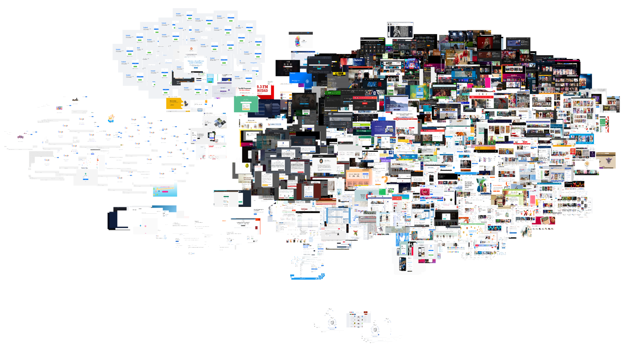
Sabrina ran thousands of images of the most popular websites in different countries through an AI which grouped them based on their similarity. She found that Japanese websites are far more likely to be brightly coloured and dense than other countries. So far so good for my hypothesis.
She ends up being most convinced by the technological arguments for the differences, specifically related to Japan’s early adoption of the mobile internet which followed vastly different standards than what would become the norm after the iPhone launched in 2007.
I personally suspect that cultural norms, pre-internet design patterns, and the written language still played a large role in shaping the Japanese internet but these things are hard to quantify. Perhaps the reason that it’s endlessly fascinating is that it’s so hard to pin down.
Ten years later, Japanese web design feels like it is slowly converging with design principles that value cleaner layouts with less in-your-face imagery but much of it is still a Galapagos island unto itself. Any new research in this area is most welcome!
Update (11/12/2022): Product manager & designer Cynthia Zhou has created a rebuttal arguing that the answer lies in cultural psychology. She contrasts how Westerners tend to be “analytical thinkers” whereas Easterners tend to be “holistic thinkers” leading to Asians seeing more about the context of any given situation. This difference in processing information leads to different ways of presenting information in these two different cultures.
I tend to think both the technological and cultural arguments are complementary to each other since one is the vehicle and the other is the lens through which we interact with and experience the vehicle. Neither Eastern nor Western approaches to design can be said to be better, just different.
Featured image from sabrinas.space
Reply