
While I design software for a living, it’s often the design of everyday physical objects which intrigues me the most. From ticket machines to toilets, every time I travel somewhere for the first time it always fascinates me to see the various ways people have solved the same problems – for better or worse.
While globalisation has led to a certain degree of homogenisation, especially within smartphones, the Galápagos syndrome (ガラパゴス化) is still alive and well in Japan where everything has developed in its own unique way. Below are just a few examples which I’ve noticed day-to-day in Tokyo.
Train ticket machines
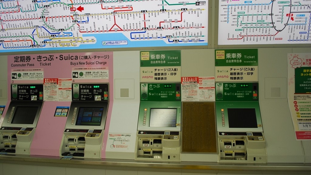
- allows users to insert a travel card in any orientation at any point during a transaction
- accepts coins as fast as you can throw them in (multiple at once)
- complex edge cases are designed in rather than designed out of the system
- this is what happens if you press the help button (must be seen to be believed)
Train ticket gates
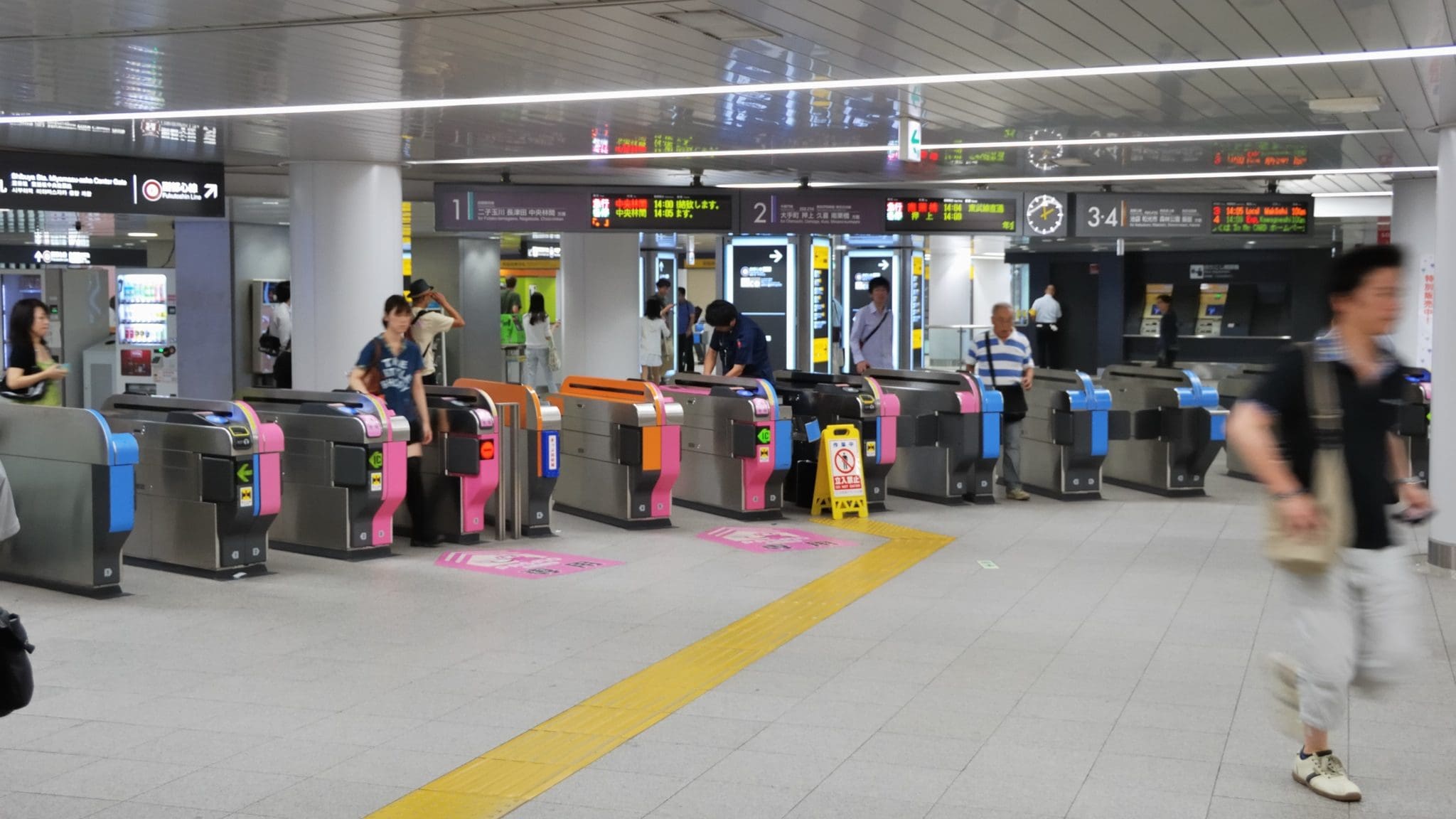
- unlike other metro systems, gates remain open unless an invalid ticket is presented
- designed with the assumption of users’ honesty (they have paid) rather than deception
- saves time and power/energy by requiring gates to close/open less often
- also accepts multiple tickets at once for multi-legged journeys
Toilet controls
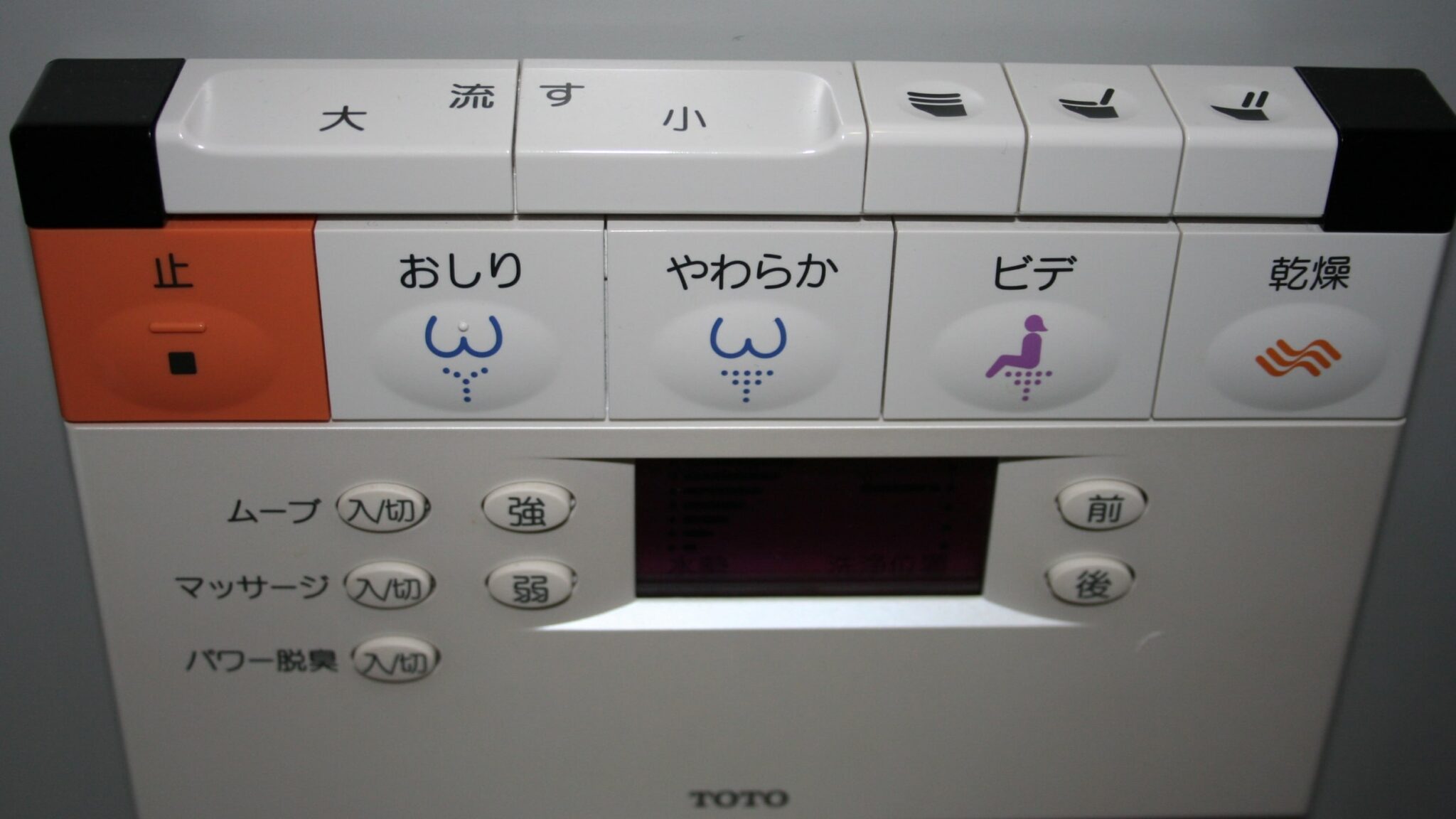
- if sanitation is a sign of economic development then perhaps Japan has gone too far!
- way too many buttons (over-designed) & icon functions unclear/scary
- most useful function (flush) is not obvious to non-Japanese speakers
Restaurant ticket machines
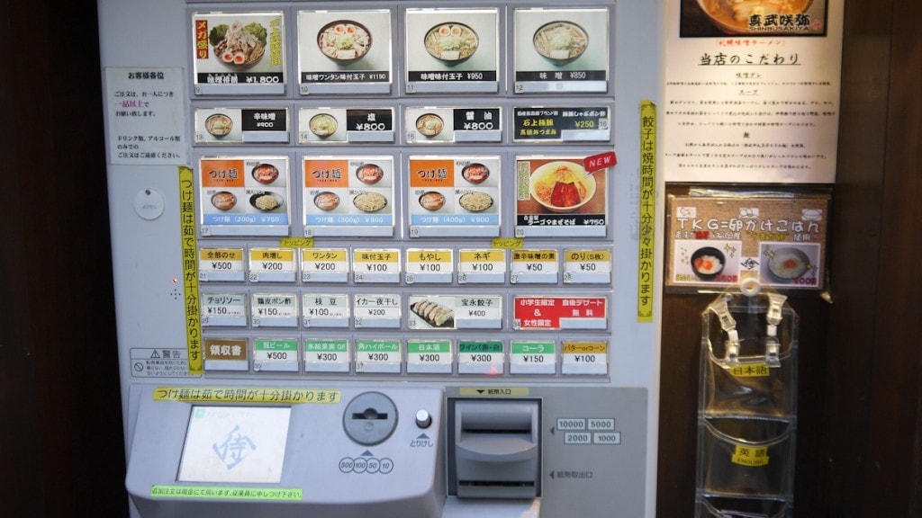
- most popular dishes are usually shown as photos at the top (easy for non-Japanese speakers)
- side dishes and drinks are shown as text below (lower priority)
- allows small restaurants to run with minimal staff (1 -3 people often)
Fax machines
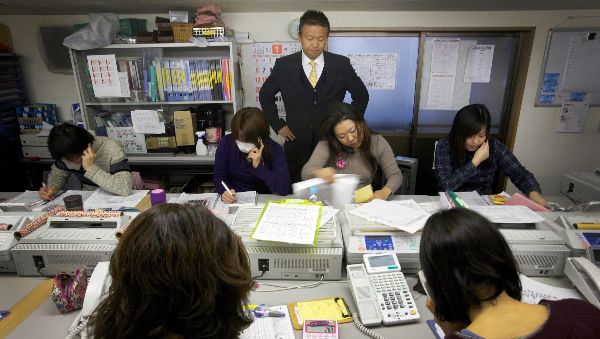
- still heavily ingrained in business processes despite being a museum piece
- sign of ageing population and “if it ain’t broke don’t fix it” culture
- perhaps a hand-written fax is more personal than an email?
ATM machines
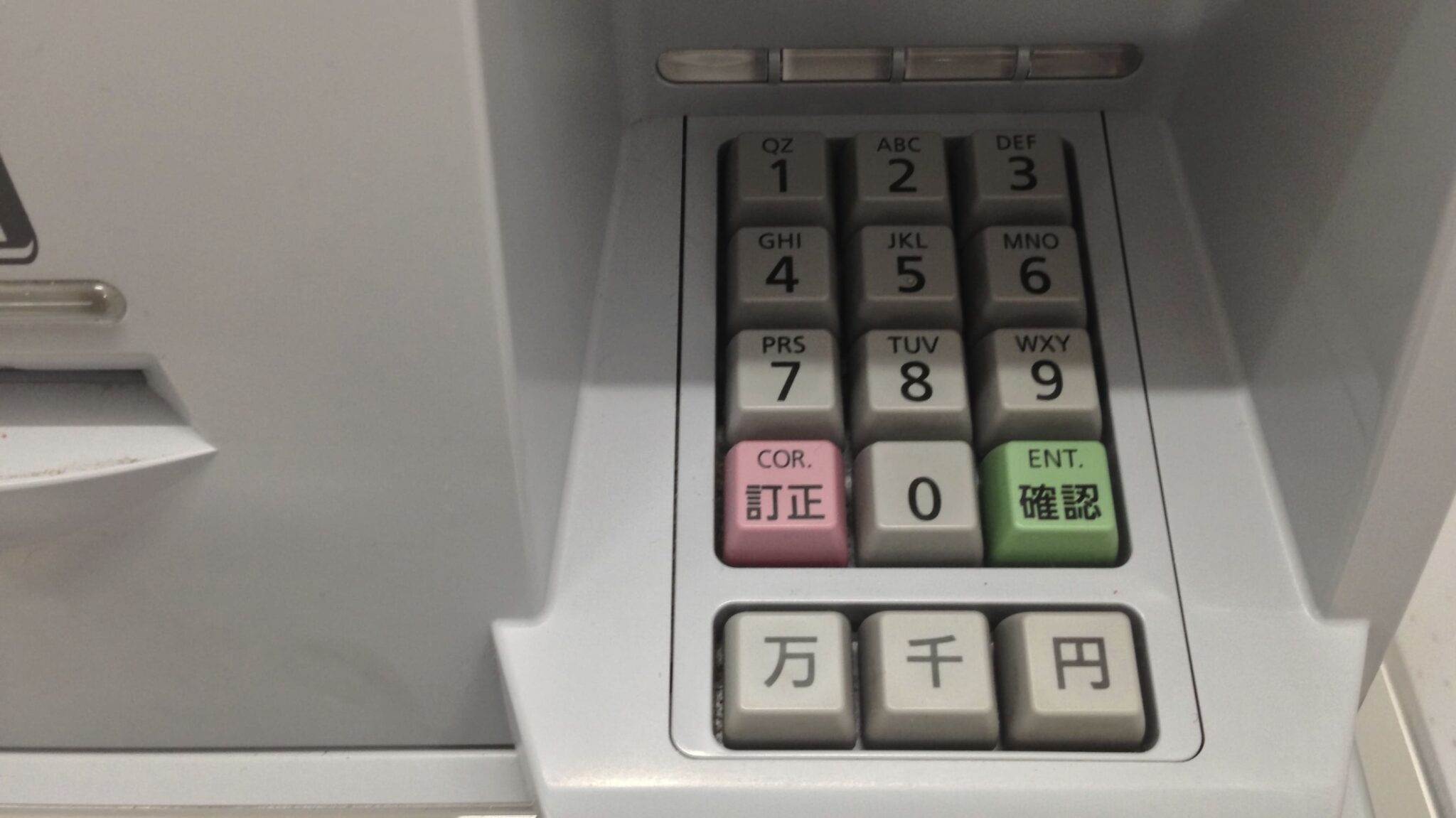
- after entering desired withdrawal amount you have to press 円 (yen) key rather than the more obvious green ENT key
- pressing 万 (10,000) or 千 (1,000) could result in an undesired withdrawal amount
- some ATMs adapt UI for foreign cards but buttons could still cause confusion
So what can we learn from all this?
- Design for edge cases, rather than around them (when appropriate)
- Trust your users (but not a loo with 27 buttons)
- Use appropriate pictures & icons
- Don’t count old tech out
- Be language-neutral
- Travel more!
Update: some interesting discussions going on about this on Reddit.
See Part 2 for more intriguing examples of how everyday objects in Japan are designed.
Reply