Today I thought it would be fun to take a trip down memory lane and take a look at how the design of Randomwire has evolved over the years:
Note: this post has been updated to reflect the further evolution of the design over the years.
2003
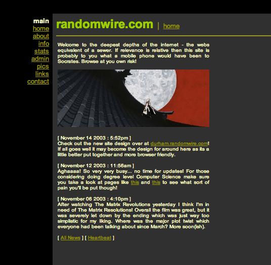
I started blogging in late 2003 (October 15 to be exact) while I was at university and had much more free time. At this time the concept of a personal blog was fairly new and the software available was very limited.
2004
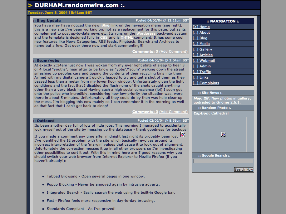
I coded the entirety of the early versions myself and it was a very basic affair using tables (no CSS) with a simple MySQL database. At this time I was obsessed with Linux so most of the content was about compiling OS kernels and other geeky stuff like that.
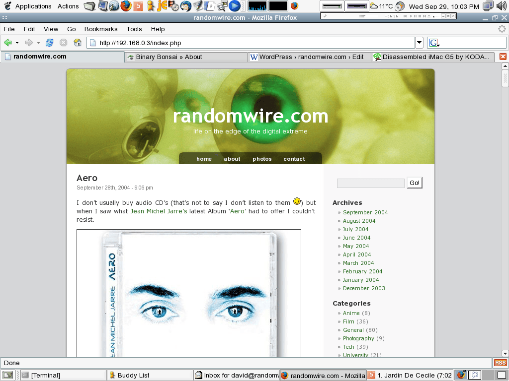
Later in
2005
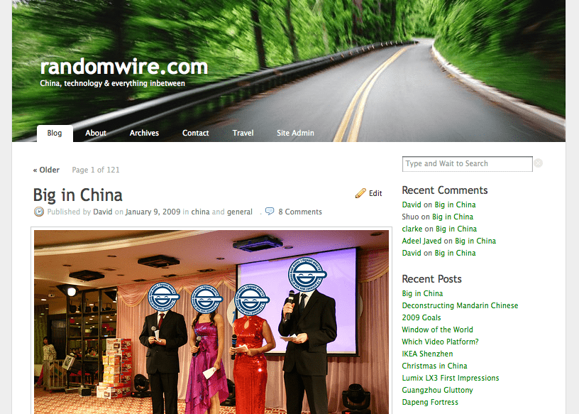
Over the next few years, I constantly tweaked the design, moving over to the K2 theme. During this time I graduated from university, got a job in London (2005), and eventually had the chance to work on a project in Beijing (2007) which was hugely exciting. I also visited South Korea a few times which was equally fascinating. All of this gave me some great original content for the blog and the hits slowly began to build.
2009
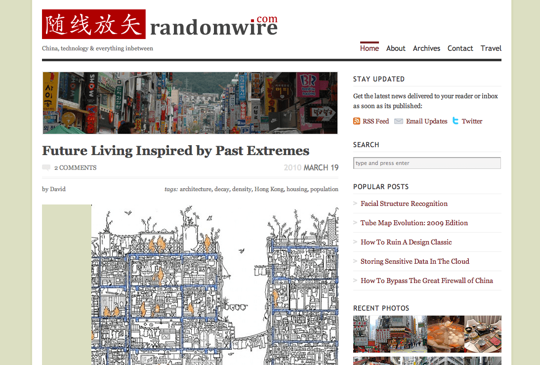
In late 2008 I made the decision to relocate to China and so began a new chapter in my life which provided ample inspiration for my writing and hopefully continues to do so. In early 2009 I changed to the Vigilance theme with some fairly heavy customisation. I liked this design but felt I could do a better job of exposing older content.
2010

In 2010 I felt it was time for a change and switched to the Traction theme which give the main categories their own menu and introduced a large featured story area at the top. In hindsight, this probably wasn’t a high point in my developing tastes!
2011
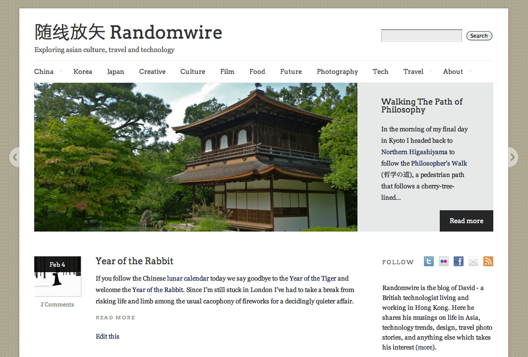
A year later in early 2011, I had the good sense to drop the dark theme and switch to the lighter Linen which came with some beautiful typography and a far cleaner layout. Around this time, I also introduced a Chinese name for Randomwire.
2012
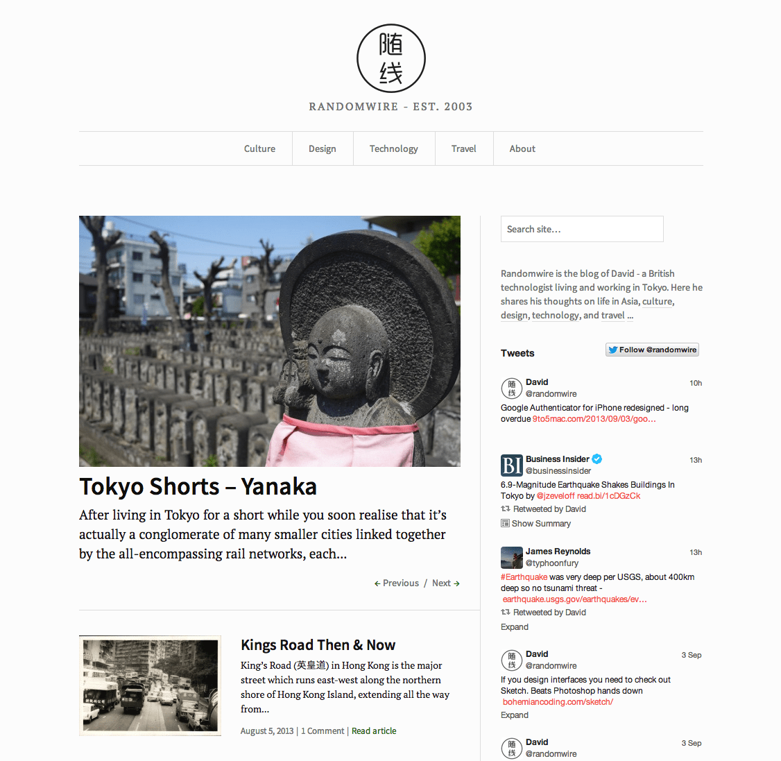
In 2012 I decided it was time to jump into the world of responsive design and moved over to the Duet theme for a few months before finally settling on a tweaked version of Watson. I also rebranded Randomwire with a new logo that followed the same minimalistic look and added maps to all the travel stories.
2015
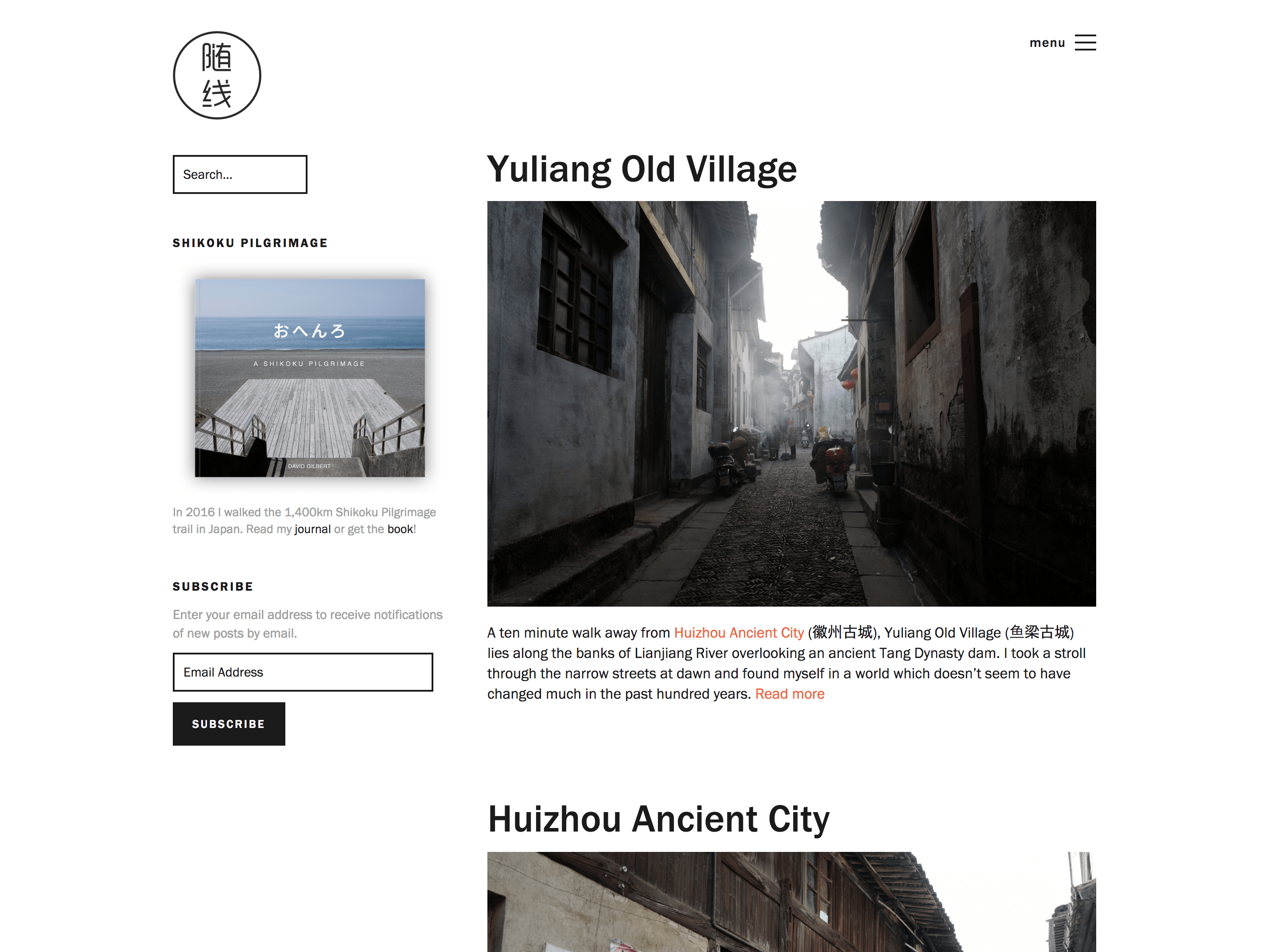
In 2015 I made a modest move to the Bailey theme which was the most minimal and clean layout I had used to date. I loved the big bold san-serif typography of this design. At this time, I also removed social buttons and feeds as even back then they felt distracting and unnecessary.
2018
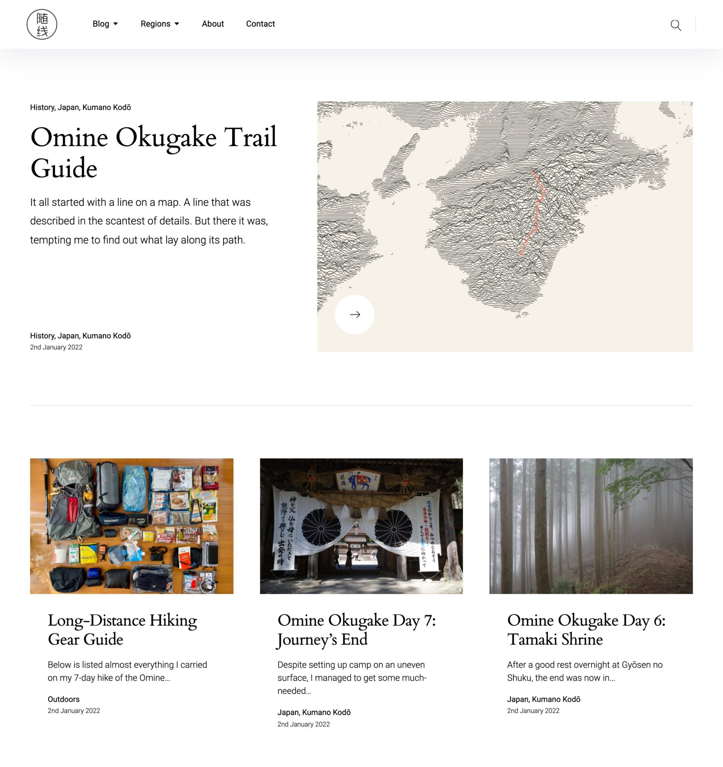
In 2018, I moved to Pukeko by ElmaStudio. I was attracted by the clean design which placed a focus on the featured image of each photo. As with previous updates, I pared back the unnecessary clutter on the homepage and simplified the navigation.
2023
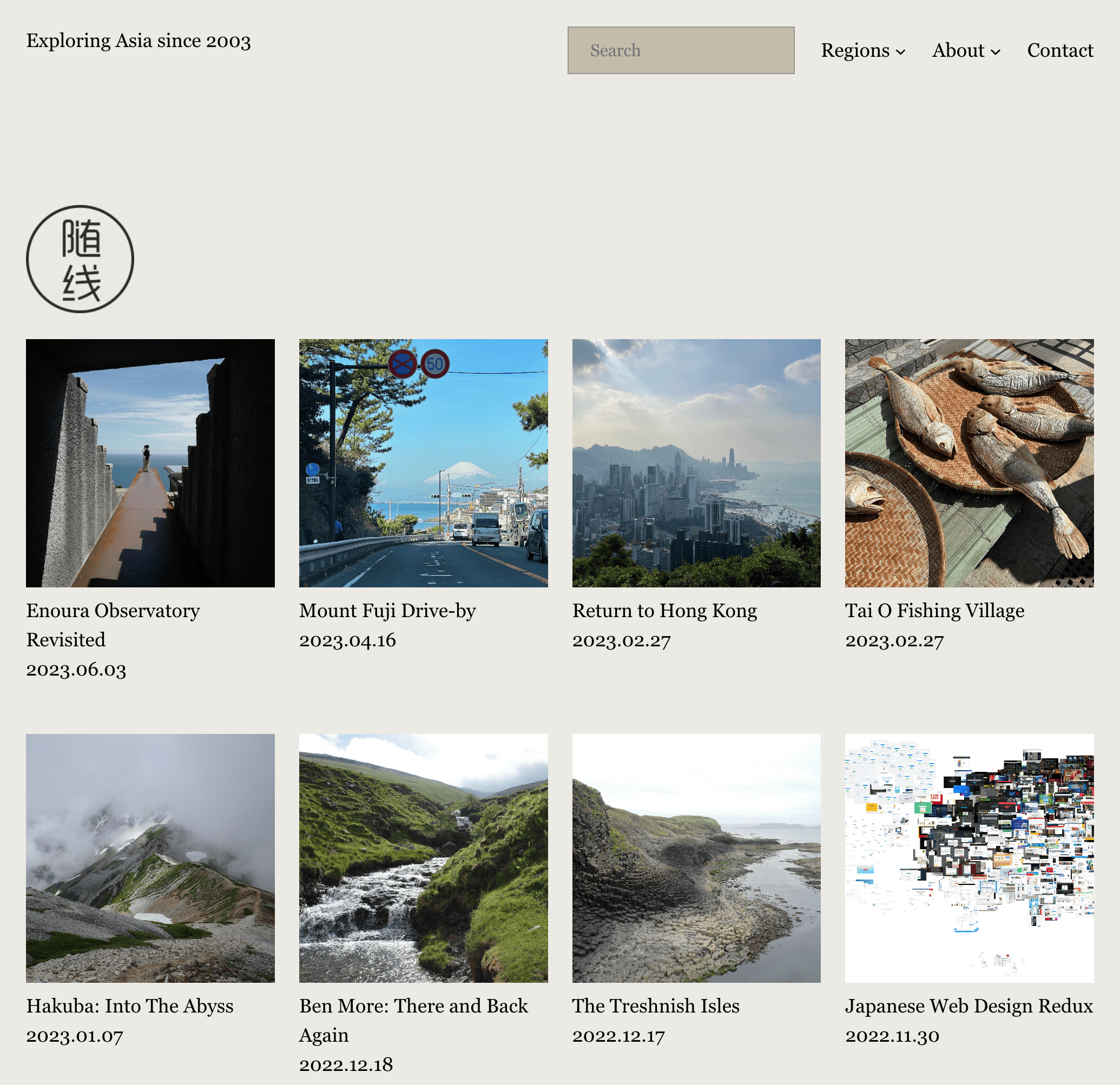
The previous theme endured the longest to date, but in mid-2023 I decided it was time for a change. I wanted to move to one of the new Full Site Editing block themes and after a long search choose Abisko by Anders Norén for its crisp typography and generous amounts of whitespace.
I’m pretty happy with the site as it is now and it’s a testament to the way WordPress has been developed over the years that I’ve managed to stay with the same CMS for all this time. No doubt things will change again so watch this space!

Reply