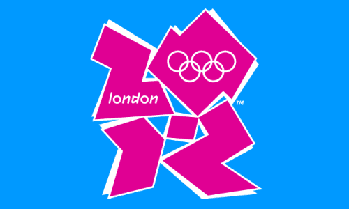
You would have thought that designing the logo for the London Olympics would have been the easy bit but if this is the best they can come up with it’s a bit depressing. London may be a “cool and happening” city but this is just not doing it for me, nor most other people but the sound of things – in the papers, on the tube, and around the blogosphere the consensus seems to be that it’s pretty awful. Personally, I thought that the logo they used for the bid was a lot better, I guess we’ve got another 5 years for it to evolve.
In tenuously related but possibly less high-profile news I’m looking to re-design the look of randomwire.com so expect to see some changes around here. Whilst I think the current site looks good it’s not changed much over the last few years so I think it’s due a refresh.
Reply