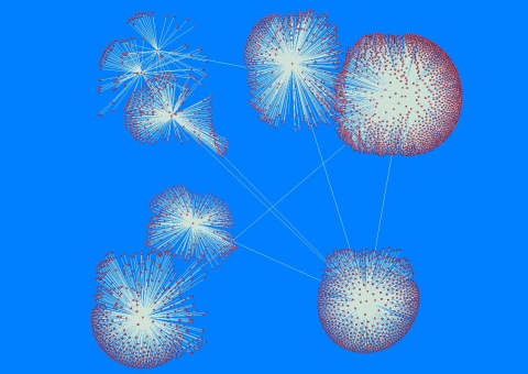
After a fairly intensive perl-hacking session last night I’ve finally managed to collect enough data to render the first proper visualisation for my major project using a force-directed algorithm (which basically means the graph arranges itself dynamically on the screen). At the moment I have a linked list containing approximately 4000 nodes which appear to be arranged in eight distinct clusters on the visualisation:
Click here for the full-sized version
This represents around half of the Durham University network. I have purposefully left out inter-collage connections as I still need time to make the scanning technique more efficient without DOSing the connection. It may not look much right now but I’m pretty pleased with it!
If this sort of thing interests you check out Visual Thesaurus for a cool visual display of the English language within an interactive map.
Reply