As hinted last weekend, regular visitors will notice a few changes on Randomwire today which are the beginning of my plan to improve the site and better define what it’s all about.
Here’s what’s new:
Logo
I’ve toyed on and off with various logos over Randomwire’s nine-year history but none of them were very well thought through and for the past few years have eschewed one altogether.
Although the name ‘Randomwire’ is hardly self descriptive I wanted a simple unique identifier for both the site and related places like social networks where it would also be used.
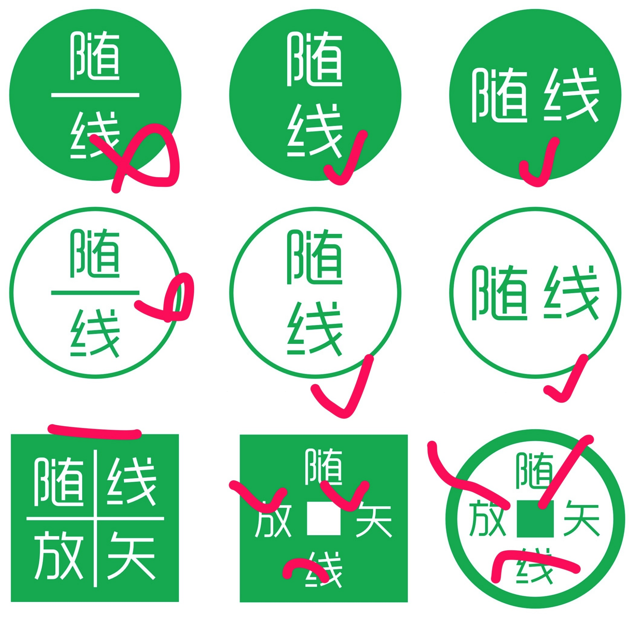
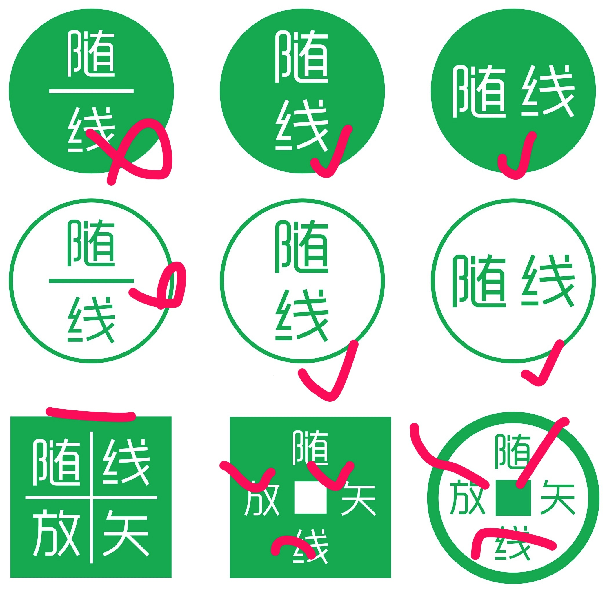
During the process of refining my concepts I decided to drop both the English words in the logo and half of the old Chinese name (随线放矢 → 随线). Instead of being an idiom the Chinese name is now just a literal translation of ‘random wire’.
Not including the English version of the name might seem a little strange but I feel it adds a certain mystique for non-Chinese readers rather than being a detractor. The characters are set in the beautiful Yue Gothic typeface which is cemented in a simple circle.
Navigation
In order to strengthen what Randomwire is all about I’ve simplified the primary navigation to highlight the core themes of the site – Culture, Design, Technology and Travel in Asia.
Using the ‘No Category Base (WPML)‘ plugin for WordPress I’ve simplified the URL structure so now the China section is just randomwire.com/china and so on. I’ve also removed the www. suffix to make things even simpler.
Maps
In the past, the only way of navigating Randomwire’s archives was to search or browse through long lists of stories as if staring into an endless black hole.
Since much of
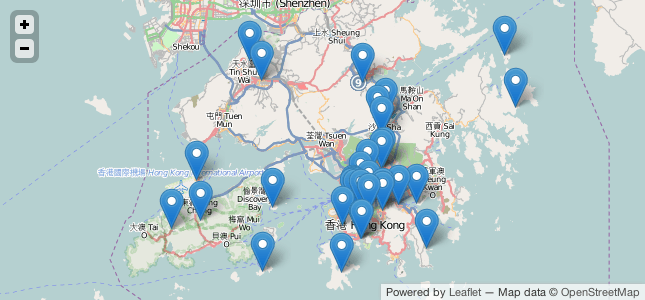
The maps display beautifully on both desktop and mobile devices – they’re even optimised for retina displays and the responsive template layout. Check out the Korea and Hong Kong sections to see them in action. I hope this will be a genuinely useful addition for readers and casual browsers.
Even More
I’m still using the excellent Duet theme from The Theme Foundry with a large number of my own customisations built as a Child Theme. Despite not being a great programmer it always amazed me how easy it is to extend WordPress.
In the process of making all these changes, I’ve done a lot of technical heavy lifting to improve the structure and display of old content while hopefully keeping things in a standard format ready for future upgrades.
Do let me know what you think of the changes and expect much more before the end of the year.
Reply