Metropolitan underground rail maps have long fascinated me for the many ways in which designers have tried to balance style with substance and accuracy to produce something which can easily guide people through complex interconnected transport networks.
The epitome of this has to be the London Underground or ‘Tube’ map which has evolved over the years from its original incarnation as a geographical representation of the actual line routes to the abstracted schematic diagram version we see today.
1932 Edition (Geographic)

1933 Edition (Henry Beck)

Beck’s map was groundbreaking for its time as it abandoned true geographic layout in favour of a style similar to electrical circuit digrams. It relied on the notion that the physical locations of the stations were irrelevant to the traveller wanting to know how to get to one station from another.
2011 Edition (Official Current Version)

I’ve written at length previously about how the map has become over-complicated in recent years and whilst Transport for London made some improvements in 2009 it seems they’ve lapsed back into bad habits with the latest edition (above). Given the number of new lines and additional information which is needed to be presented this isn’t perhaps surprising.
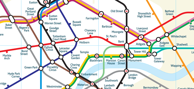
2011 Proposal (Mark Noad)
Recently British designer Mark Noad has tried to address some of the problems of the current version with a new beautifully designed map which goes back to a more geographically accurate representation using 30- and 60-degree angles instead of 45 as in Beck’s which “shortens the extremities of the lines to make it more compact”.

At a glance, the changes are striking, yet not totally unfamiliar to anyone used to the current incarnation. Despite more than double the number of lines, there is a definite similarity to the 1932 edition. Most impressive is the custom-made font – New Underground Condensed – which is based on Edward Johnston’s original.

Some first impressions:
Pros
- Better integration of DLR (turquoise) and overground lines (orange)
- Iconographic representation of interchanges with network rail services
- Sense of distance between stops (not sure how accurate this is)
Cons
- The Circle Line isn’t a complete circle which is accurate but feels wrong
- Zone 1 looks very spaghetti-like (technical term) and hard to follow at busy junctions
- Some places where lines cross over each other feel jarring (e.g. Waterloo & City line)
This is probably the best attempt at overhauling the map which I’ve seen, but to my logical mind moving away from 45° angles makes the whole thing less easy to read at a glance, even if it does provide you with a better comprehension of the geography above ground.
Apparently, an iPhone app version of the map is in the works and it’ll be interesting to see if it catches on – I wouldn’t be surprised if TFL will be watching this one closely. Feel free to let me know what you think below.
Reply