
So it looks like someone at TfL was listening last year when I posted my critique of the 2008 version of the London Underground Tube Map which had become horribly cluttered and complex. Last month they issued a new version of the map which immediately sparked controversy because the River Thames had been removed along with many other changes designed to simplify the map which made the original so effective. Now that the outcry has died down I thought I’d take an objective look at the changes…
Let’s recap – the clean and simple 2004 version:

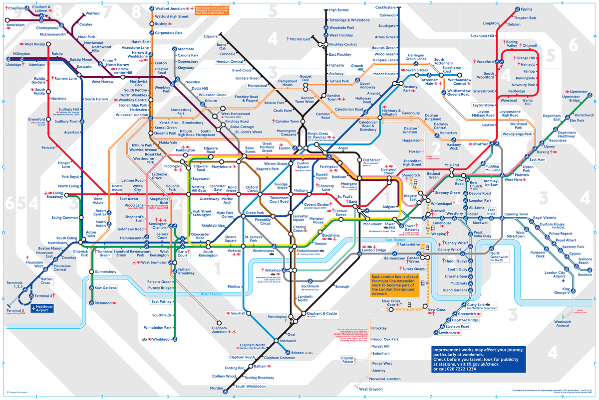
The horribly complex and cluttered 2008 version:
Leading to the new 2009 version:
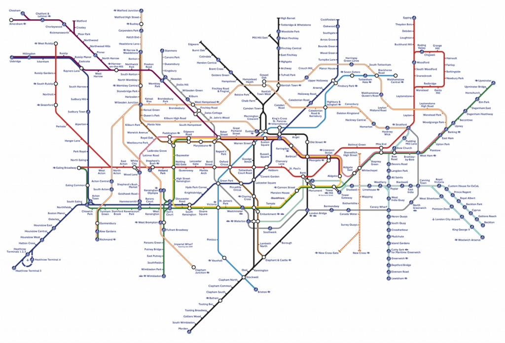
What a breath of fresh air – at a glance you’d think they’d simply gone back to the 2004 version but aside from the obvious removal of the river and fare zones there are some more subtle omissions:
- walking distances
- blue/orange info boxes
- limited-time junctions (e.g. Kennington, Woodford)
- “check before you travel” symbols
In keeping with the tidy-up the DLR and Overground lines are now better integrated into the rest of the system and many junctions have been simplified. The wheelchair accessibility symbols are still excessive (but probably required by law).
In general, I like this new design a lot; it solves most of my gripes with the 2008 version and brings back a certain artful elegance to the classic design. There is only one problem I have with this version: the lack of the River Thames. This was an iconic part of the map which was also a useful geographical indicator to help you know which side you were on (North/South). Apparently, Major Boris Johnson feels the same way and has promised it’ll be reinstated so it’s not all bad news.
Despite its drawbacks, the London Underground is the circulatory system that supplies the lifeblood to the city so it’s no wonder that people are passionate about how we look at and navigate through it. Within the perspective of its evolution it seems that a step backwards was needed to move things forward; “back to basics” if you like. It will be interesting to see how this continues to develop but TfL definitely deserves a small pat on the back for taking this brave step.
Reply