Since the introduction of the iPhone in 2007 the tech world has been solidly focused on mobile and for many publishers having a mobile presence has become a must (often regardless of user’s actual needs). Of the thousands of apps available, the average user will probably only use half a dozen with any regularity, so cementing your app in this hallowed position is no easy task.
Background
Over the past year, I’ve been fortunate enough to be involved in a number of mobile projects (apps + web) and I wanted to reflect on the lessons I’ve learnt along the way and highlight some of the useful tools out there that can help you on your way.
Design process
In the beginning, you start with a vague idea but the most important questions to answer upfront are why would someone want to use this? and what will make them want to continue using it? In other words what value will your product provide your users? If you can’t come up with a compelling answer then now is the time to stop and rethink.

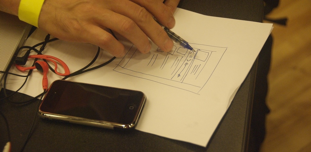
Once the basic requirements are fleshed out I like to start sketching out ideas on paper, rapidly refining them until they are at a point where I am happy with the general flow. You don’t need to be an artist to do this and it is generally faster than jumping straight in on the computer.

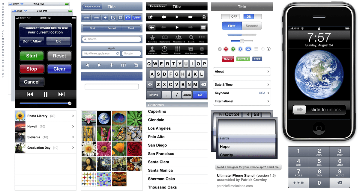
I then move into OmniGraffle (my favourite tool for creating mockups) and began to experiment with how it might look. There are some great stencils available which can get you quickly started with the standard iOS components. On each screen mockup, I like to annotate the different touch gestures which are available – this is particularly important for developers and anyone else to understand your intentions.
A handy way to present and test mockups is to save each screen as an individual image to a Dropbox folder and then browse through them as a slide show on your iPhone using the Dropbox app.
Multiple platforms
While my personal bias leans heavily in favour of Apple’s iOS platform, I’ve also worked on apps for Android and Nokia (both Symbian & Meego). The key issue when designing across multiple platforms is in maintaining consistency while still respecting the different sets of UX guidelines. Throw into the mix Android device fragmentation and you’ve got a design nightmare from hell.
Don’t try designing/building in parallel if you want to remain sane!
API
If your app is going to read/write data from the web then you’re going to need an Application Programming Interface (API) which provides a standard mechanism for your app to talk to a Content Management System (CMS) using structured XML/JSON markup language.
The tricky part is often serving images which need to be provided in a standard set of sizes/ratios. For open source CMSs like Drupal you can use modules like ImageCache which enable you to build a workflow for editors whereby they upload each image at a high resolution and then the CMS automatically scales and compress’ it into a number of preset sub-sizes to be served through the API.
Between your API and the app, you’ll want some sort of caching layer(s) to prevent traffic spikes from crippling your servers. Common solutions include Memcache, Boost, Varnish, and Akamai which may be used individually or in conjunction together.

It’s important to think through the API structure carefully since once the apps are launched you can’t just change it on the fly without breaking them (versioning can help).
Implementation
Whether building the app in-house or outsourcing the development work elsewhere I prefer to take an agile approach to iterative development (using SCRUM), using tools like Basecamp or Pivotal Tracker to project manage the entire process. This helps maintain a ‘single source of truth’ where each team member can always access the latest information and assets.
Getting real feedback is essential for being able to review and refine functional elements since mockups can never tell you exactly how it’s going to feel in your hands. Apple doesn’t make it particularly easy for developers to distribute apps for beta testing before release to the App Store but luckily TestFlight has come to the rescue with a far less painful system. Constantly question the value of each element to ensure you only include those that are absolutely necessary – this is harder than it sounds since the temptation and pressure is often to do more than is needed. Less is more.
Mobile app versus mobile web
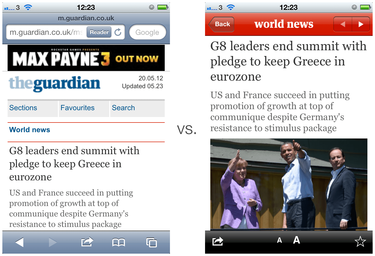
At this point you might be asking why you need a mobile app when you can target all smartphone platforms with a mobile web site instead? The arguments for and against each approach are well documented but the simple answer is that in order to distribute through as many channels as possible you need both.

While native apps do provide an arguably slicker user experience than a mobile website when it comes to people sharing links through social networks like Facebook and Twitter the mobile website is still going to be a user’s first point of contact and provides a better experience than being directed to the desktop version in a mobile browser.
Using a Content Delivery Network (CDN) like Akamai you can automatically detect whether the user is on a mobile or desktop browser and redirect them between the two versions as necessary. In the next few years, it seems likely that HTML5 and responsive design will further narrow the gap between each approach making it even more of a moot point.
Lessons learnt
- Mockup every detail in every usage scenario – no matter how obvious or trivial something might seem to you, your developer will build it differently if you don’t, but remember you still need room to refine (see next point).
- Build a prototype then remove as much as you can – some things only become obvious once you begin to use something for real and a working prototype is the best way to do this before being fully committed.
- Don’t try to develop on multiple platforms at the same time – unless you have a strong grasp of the different UI patterns and guidelines for each.
- A solid API and good documentation go a long way – remember that the app is only half the solution. The API which serves and receives data from the app has to be just as well thought through (some useful pointers).
- Never go near a non-native app development environment – you might save a bit of time but ultimately won’t end up with a product which is nearly as performant or as polished as a native app. It just isn’t worth it (see next point).
- Performance is key to a good mobile user experience – nobody likes laggy interfaces, especially so on mobile where people expect perfectly fluid interactions. There are lots of tricks to optimise this but don’t underestimate how much time it will take.
- Backup your app store encryption certificates/passwords – misplacing these can be a very painful learning experience as they cannot be recovered.
- Test, test, test – nothing is ever 100% bug-free but by thoroughly testing each function from end to end you’ll likely pick up most of the big ones. If you’re using URL redirection anywhere be sure that referral data is being passed along correctly.
Conclusion
Whereas on the desktop the temptation is to jam-pack every pixel of white space with irrelevant junk, designing for mobile comes with its own set of constraints which force you to focus on the key features which really matter. This is a good thing but can be hard when a large number of stakeholders are involved. As the demand for mobile-first products increases, so hopefully will understanding and thus design should improve across the board.

Reply