In this age of ubiquitous connectivity there is very little we do which isn’t tracked and stored in some form or another be it active (something we request) or passive (something which happens automatically behind the scenes). This data is used for a variety of reasons; marketing, personalisation, recommendation, law enforcement, research, capacity planning, trend analysis, performance enhancement… – the list is almost endless. It spans both our online and offline lives, whether we like it or not, and is becoming ever more sophisticated in its reach and depth.
Being a bit of an analytics junkie I decided to take a look at what all my favourite applications/services offered by way of being able to visualise some of this data –
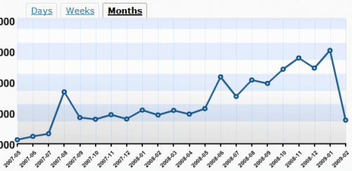
WordPress blog stats for randomwire.com show slow but steady traffic increase month-on-month (actual numbers obfuscated). The two mini traffic spikes were caused by exceptionally popular posts (1 / 2).
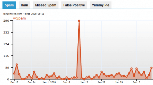
WordPress comment spam is being tracked and auto-deleted by Akismet. Spikes show a targeted attack/flood. 40,683 spams were caught and an overall accuracy rate of 99.855%. Petty impressive.

Feedburner RSS stats showing the number of subscribers and reach of the syndication feed (actual numbers removed). Because of the way feeds are ingested and used these stats should only be taken as a guideline at best.

Flickr photo view stats tracking 3,404 items / 13,251 views to date. Difficult to infer anything here but generally I’ve noticed the more metadata you add (especially titles) the more hits you can expect.
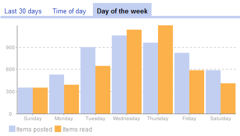
Google Reader trends – “From your 86 subscriptions, over the last 30 days you read 4,858 items, starred 15 items, shared 16 items and emailed 2 items.” Saturday – Monday clearly slow news days in the blogosphere.

FriendFeed activity stats show a breakdown of top sites from the past 30 days of online activity. Twitter is dominant in this group at least but the ability to re-share and re-tweet these stats may be incestuous.
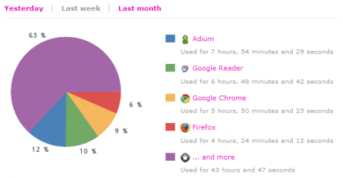
Wakoopa applications stats show application usage over the past week equating to an average of 10 hours per day – I really must cut down! Interesting how I’m now using Google Chrome more than Firefox these days.
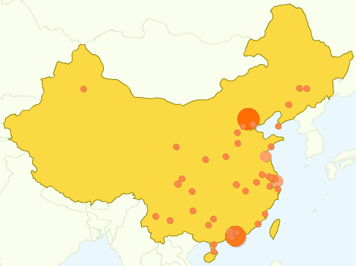
Google Analytics map overlay shows visitors to the blog from China – most were from Beijing or Shenzhen (where I live) clustered in the more developed east of the country. Unfortunately no readers in North Korea!
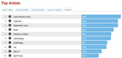
Last.fm top artists list artists by the number of times I’ve played their tracks since installing the “audioscrobbler” tracking application. If someone asks me what sort of music I like I just point them here.
Whilst this is all fairly rudimentary it provides some basic insight into some of the data we generate. Already many services provide semi-open interfaces to allow other applications to take data and create mashups and this is likely to become more pervasive and easier to do. Personally, I just like looking at pretty graphs!

Leave a Reply to Rebecca Cancel reply