At the beginning of 2012, there were very few examples of large websites which had adopted responsive layouts, an approach to web design whereby the page is able to automatically scale to provide an optimal view experience for whatever device is being used (desktop, tablet or smartphone). Now as we approach the end of the year it’s been exciting to see an explosion in the number of big sites employing this technique to great effect.
Beyond just scaling between small and large screens this new breed of site improves the user experience in a number of important ways:
- Less clutter
- More creative layouts
- Better typography
- Faster load times
- Less obtrusive and smarter advertising
While it may be still too early to draw conclusions it is encouraging to see these early adopters pushing forwards better standards of design and usability which others will follow and continue to improve upon. To me, responsive design is not a fad but rather a sign of the growing maturity of the web as it continues to replace traditional forms of media (print and television).
Below are some of my favourite examples:
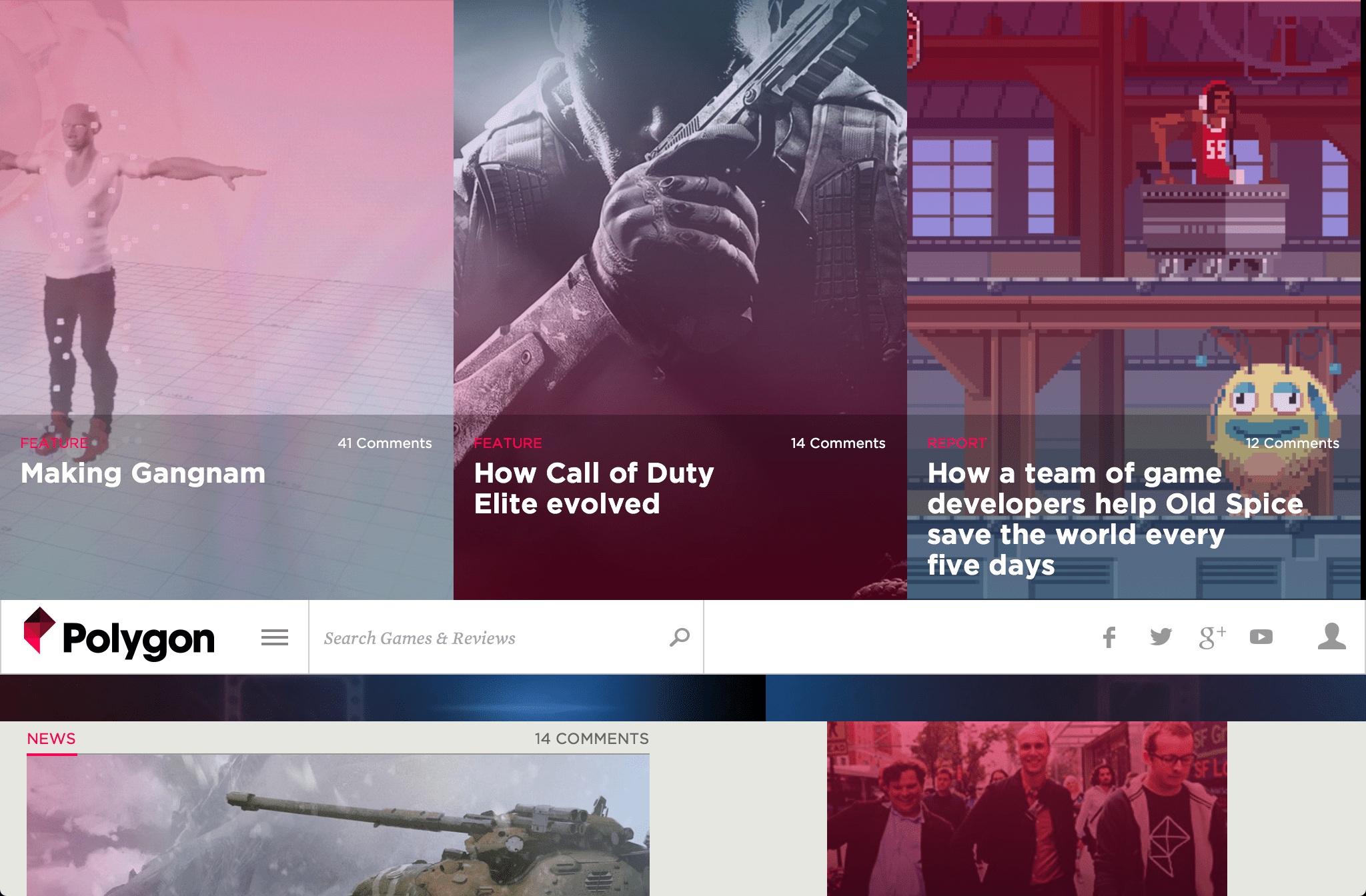
Polygon

Polygon is a new video gaming site from Vox Media which recently launched with a startlingly fresh design that, like its sister site The Verge, breaks new ground in the custom styling of editorial content. It includes rich graphical hero stories placed right at the top of the page above a floating navigation bar and somehow manages to make pink look good.
Their ongoing ‘Press Reset‘ video documentary series provides some useful insights into how the site was built.
The Next Web

The Next Web was known for being a heavily bloated affair before its most recent redesign, but no longer. Its beautiful new minimal and finger-friendly layout includes a floating list of the latest and most popular stories on the left encouraging users to read more. Thanks to HTML5 page loading performance is also greatly improved.
USA Today

USA Today is hardly a brand well-known for being a trailblazer but its new site is nothing short of revolutionary compared to what came before it. Clearly optimised for tablet consumption the design includes left and right navigation arrows which allow users to quickly navigate between sections and stories. Clicking or tapping on a story opens it in an overlay making the experience feel more like you’re using a native app than a website.
Mashable

While still officially in beta Mashable deserves a mention for its upcoming responsive makeover which includes three collapsible columns which are displayed depending on the screen size and orientation being used to view it. Of note are the navigation menus which include previews and links to the latest stories contained within each section.
The Boston Globe

The Boston Globe was the first large/corporate site to go responsive in 2011 and it’s still among the best. Its layout and typography retain clear echoes of its paper heritage but does so without getting stuck in the old conventions which print entails.
Microsoft

Until recently Microsoft has never been known for its design sensibilities so all hell froze over when Microsoft recently unveiled its new responsive homepage which turned out to be uncharacteristically good. The story of how it came to be is equally interesting and hopefully, the rest of the site will eventually get the same treatment.
Other notable sites that have gone responsive:
The next time someone asks you to justify why they should consider adopting responsive design just point them here or to one of these sites which I think speak for themselves.
Reply