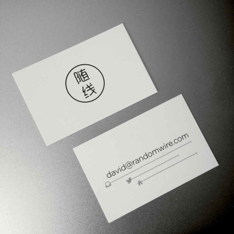
I recently designed some new business cards for Randomwire and instead of the normal multi-field affair I wanted to make it as simple as possible. Since my email address already contains my name, Twitter handle, and website address I choose to show just that with a bit of markup to delineate each part:

A friend of mine pointed out that someone had already done something similar but mine uses symbols rather than words as markup. I’m not sure which is more/less ambiguous but I’d like to think mine might work better in a multi-lingual environment.

I think the end result, printed by moo, came out quite well!


Reply