Found a cool visualization today [via kottke.org] called the ‘Map of Creativity‘. Its aim is to present an “interactive database of innovative educational projects throughout the world“.
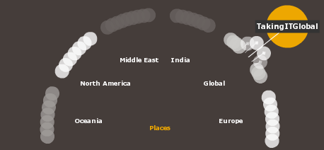
The map itself is very innovative, allowing you to drill down to different projects by geographic region whilst the visualization dynamically re-arranges itself accordingly. I especially like things like this which allow meaningful interaction without detracting from what it is trying to achieve – something I hope I can carry through with my visualization project this year.
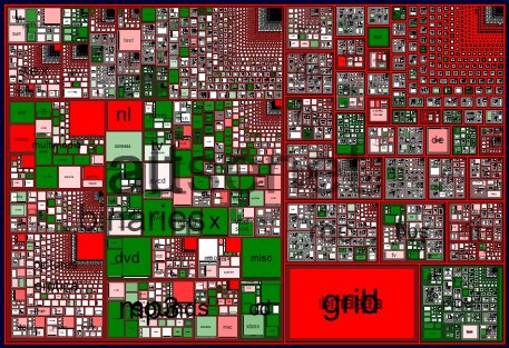
If you like this then you might also like to take a look at Netscan which is another good project that looks at mapping hierarchical relationships of Newsgroups on the Usenet. Variations in colour indicate a change in the number of posts for this month compared to last month.
An aside: If you like photography take a look at ‘Small World Gallery‘ which focuses on the fascinating art of photomicrography. The images were captured through a microscope and are quite incredible to look at.
Reply