There seems to be a bit of silent revolution sweeping the Internet right now being that of information association – web portals are springing up which allow you to upload various content and categorise it according to keyword tags as well as others which allow you to carry out visual query’s on data scraped together from a variety of different sources. It’s all very cool until you realise just how much information there actually is out there now – more than it’s worth thinking about! Recently I’ve noticed a growing number of small online visualisation tools which allow you to carry out dynamic queries on this data – some of it’s purely for fun, while others have serious objectives. Below I’ve gathered together and listed some of my favourites:
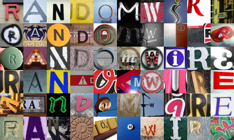
Flickr Spell is a cool little web app that allows you to spell out words using images from Flickr (surprise surprise!). Kind of like the old-style blackmail notes using cut-out letters from a newspaper but brought up to date in a more 21st-century style!
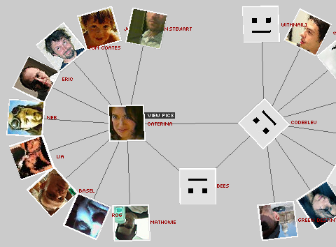
Flickr Graph is an interactive flash animation that explores the social relationships inside Flickr. It uses the classic attraction-repulsion algorithm for generating graphs showing links between users. I especially like the way you can view a user’s pictures associated with their information, very slick!

Newsmap is an application that visually reflects the constantly changing landscape of the Google News news aggregator. It employs a treemap visualisation algorithm to condense all the information into recognisable coloured bands for each category of news. Neat!
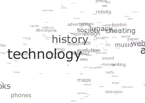
Extisp.icio.us takes the tags of any given del.icio.us (a social bookmarks manager) user and visualises them based on the number of entries per tag. Outputs a sort of ‘brain map’ using CSS similar to what Technorati does. Apparently, the placing of the tags is entirely random!
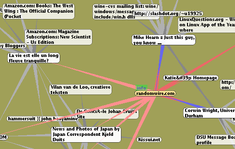
GoogleBrowser builds up a graph of related pages to the URL you enter by retrieving similar-page results from Google. Interesting (and sometimes worrying!) to see what Google thinks is a similar page to your own! A bit memory/CPU intensive but give it time and it eventually settles down.
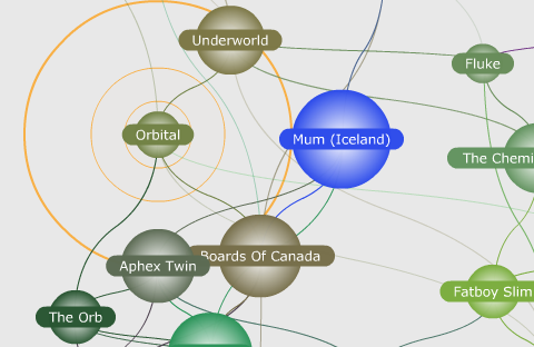
Uses info from Amazon to map associations between music and movies. It can help you find stuff you might like based on your current tastes, as well as showing just how narrow (or wide) your tastes actually are! Pretty clever, good for market trend analysis I would imagine.
If you know of any more of these cool tools please let me know so I can add them to the list!

Reply