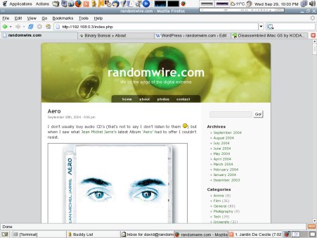
I’m rapidly becoming bored with the design of the site at it is at them moment. It seems fairly flat and lifeless. With this in mind I’m working flat out on a new design for the site which I hope to unveil some time over the weekend. This will be timed to come online when I move web services onto my secondary server. Here’s a little sneak peak of how things should look:

As ever I’m trying to stick to all the major standards (XHTML, CSS etc) and hopefully people will like the new look!

Reply