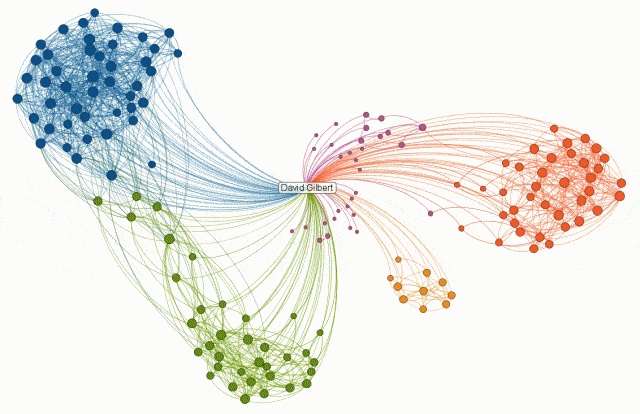
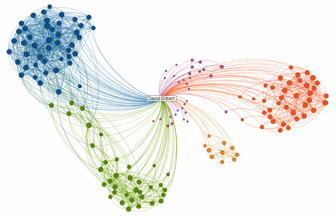
LinkedIn, the social network for professionals (think Facebook, but more serious), has launched a new service called InMaps that visualises your ‘connections’ to other people as a single network graph. I had a play with it earlier and here’s what my network of 163 people who I’ve connected with through work looks like:

Each colour corresponds to a different group within your network, which has been automatically identified based on individual affiliations – bigger dots represent people with more connections than others. The video below explains things a bit more.
I find it interesting to see how the segments within my network are quite distinctly split along geographical lines – Blue / Green represent colleagues on different projects I’ve worked on in the UK, Purple / Orange represent colleagues in Beijing and Shenzhen, with the small Yellow cluster being colleagues in Pakistan.
It would be great to see a tool like this which could do the same for all your online networks and then allow you to see the wider connections between them. I’m sure you’d be able to produce some pretty interesting metrics about individual levels of influence.


Reply