Been a stressful last few days with deadlines looming and things are becoming a bit tense. Food in college has reached new lows recently so cheese sandwiches are becoming more regular 😉 Other than that things are good – at least my room is big, warm & relatively comfortable! Since my recent foray into graphic design I’ve been searching around the net and have found some pretty good design blogs which I’ve added to a new links category on the nav bar. Check them out!
By chance I’ve stubled accross a lot of facinating photography related links recently which I though are worth sharing:

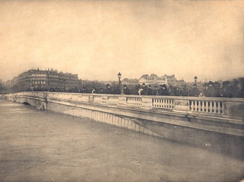
Photos of Paris Flood, 1910 – Amazing Sepia and B&W photos of Paris underwater.

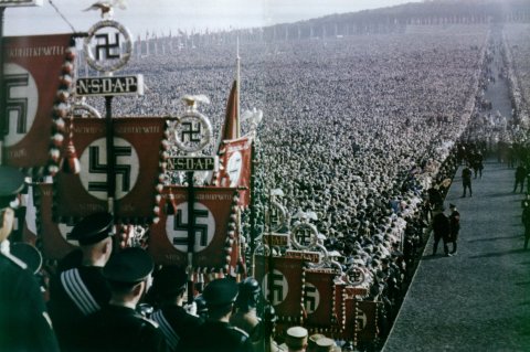
World War 2 Pictures in Colour – Another incredible collection of photos which brings home the realities of what my generation has been lucky enough to have never experienced. Definitely worth a browse.
Telephoto Is For Cowards – How to take ‘candid’ photos without looking like an idiot brandishing a camera!
Technicolor – An explanation to what it was/is for those who have ever wondered when you see the logo before an old film shot using this unique method for getting colour from B&W film.
[Some links via kottke.org]

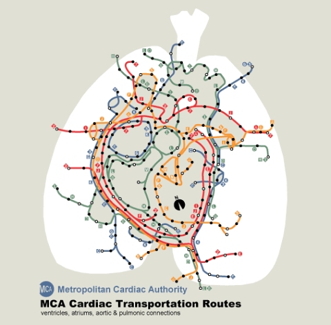
Looks like someone else has been getting creative with quasi geographic representations – cool!

Reply