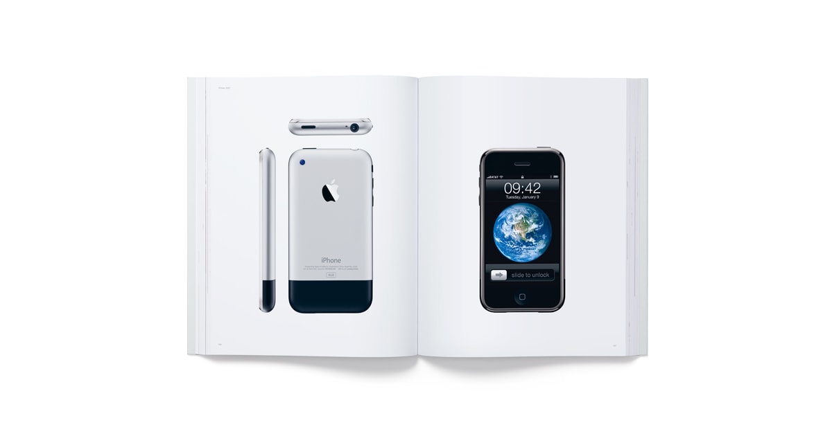
Design is…

I’ll save passing comment on iOS 7 for another day (short version: brave new world) but more than this I wanted to share the beautiful video’s Apple made explaining what design means to them – a mission statement if you like.

“I think there is a profound and enduring beauty in simplicity, in clarity, in efficiency. True simplicity is derived from so much more than just the absence of clutter and ornamentation, it’s about bringing order to complexity.”

Jony Ive

“Most people make the mistake of thinking design is what it looks like. People think it’s this veneer — that the designers are handed this box and told, ‘Make it look good!’ That’s not what we think design is. It’s not just what it looks like and feels like. Design is how it works.”

Steve Jobs
David avatar

3 responses

  1. I love these two videos, and I love what they did with iOS7 and OS X Mavericks. I was happy, that iOS was completely redesigned on the surface, and added a lot of new functionality, while retaining the same architecture. I felt that one of the themes throughout the keynote was “payback time” to all the pundits, who kept saying Apple doesn’t innovate anymore, Apple is doomed etc. It was a different Apple this time. Polite on the outside, but angry, aggressive, and confident. Looks like they’re finally taking Android seriously, it was mentioned several times during the presentations. I’m also pleased to see that OS X retained the same design, but added a lot of features for power users, and tweaks on saving CPU resources. I love OS X’s design as it is, we don’t need another Windows 8 design fiasco on the desktop. Windows 8 is ahead of its time for most Windows users, the timing was bad I think. Now I’m looking forward to new hardware in the fall.

    How did you see the whole keynote?

    1. To be honest I never expected them to go this far with the redesign. I imagined they would just tone down iOS6 instead of going for a whole new look. It’s going to be extremely exciting to watch this unfold – very brave and confident of Apple. I think it signals a new beginning for them post Steve Jobs.

      I had a play with the beta of iOS7 last night and I imagine most users are going to be in for a shock. Change always provokes strong opinions and I bet this will divide a lot of users but I think after a week or so they’ll never want to go back.

      I find the flatness in Android and Windows Phone to be rather clinical and cold but in iOS7 it feels far more playful and dynamic. In other words its really enjoyable to use and will be easy for existing/new users to pick up.

      At the same time many elements feel a bit rough around the edges and rushed. I hope between now and the final release they have time to work on polishing it. I’m still in two minds about those icons!

      1. Some icons will take some time to get used to, and perhaps they will do some more changes until the final release. But as you know, everyone has tons of apps, and some of the stock apps land in folders or somewhere at the back, and seldom get used (in my case Passbook, iTunes, Videos). It will be interesting to see, if devs gonna follow Apple’s icon and app design. The new iPhone will bring a huge momentum to those who want to challenge well established apps with new fresh iOS7 design.

        Btw, I wonder if they removed “Tap to Tweet” in iOS7, I really love this function. If they did, what else was also removed that you liked or was used to?

Reply

Your email address will not be published. Required fields are marked *