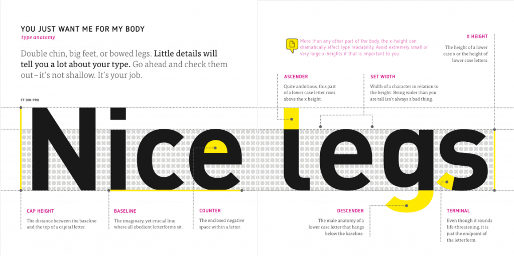
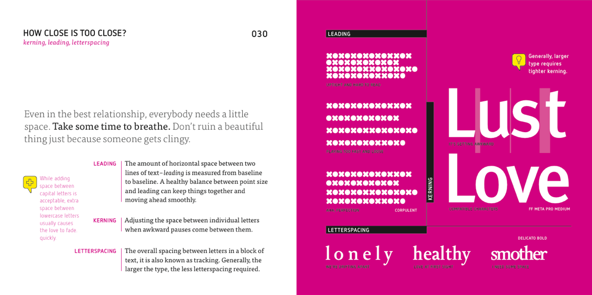
I never knew there was an art to typographic design until one day one of my friends told me she had studied it (while simultaneously trashing the layout of something I had just made). This new world of serif, san-serif, ascenders, descenders, terminals, baselines and kerning fascinated me so I set out to try to educate myself on the subject.
You may notice that you’re changing. You’re noticing different letterforms. You may feel different around them. Don’t be embarrassed; these feelings are natural. A few basics can help you through the awkward years.
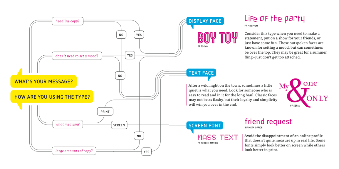
There’s a plethora of information available online for budding typographers but just about the best resource I’ve found comes in the form of a free eBook from FontShop called “Meet Your Type“:

As you would expect it’s gorgeously presented and provides a concise but playful guide to the world of typefaces and how to use them which pretty much anyone with an eye for design can appreciate.

It is surprising just how much more involved typesetting your design can be. Even if the extent of what you need it for is creating the odd PowerPoint presentation there are still plenty of lessons to be learnt here.

After learning the nitty-gritty of what typography encompasses I’ve been left in awe at the amount of painstaking work that goes into creating fonts and the care and attention that designers put into using them. It’s worth considering the next time you’re looking for an alternative to Arial or Times New Roman.


Reply