One of my ambitions in life is to design and build my own house. I am not strictly a designer or builder but I do have a very clear vision in mind of what I would like to create eventually. I think the first step towards this would be to start with something a little more manageable in scale and while researching the possibilities, a number of projects which make very clever use of small spaces caught my attention…
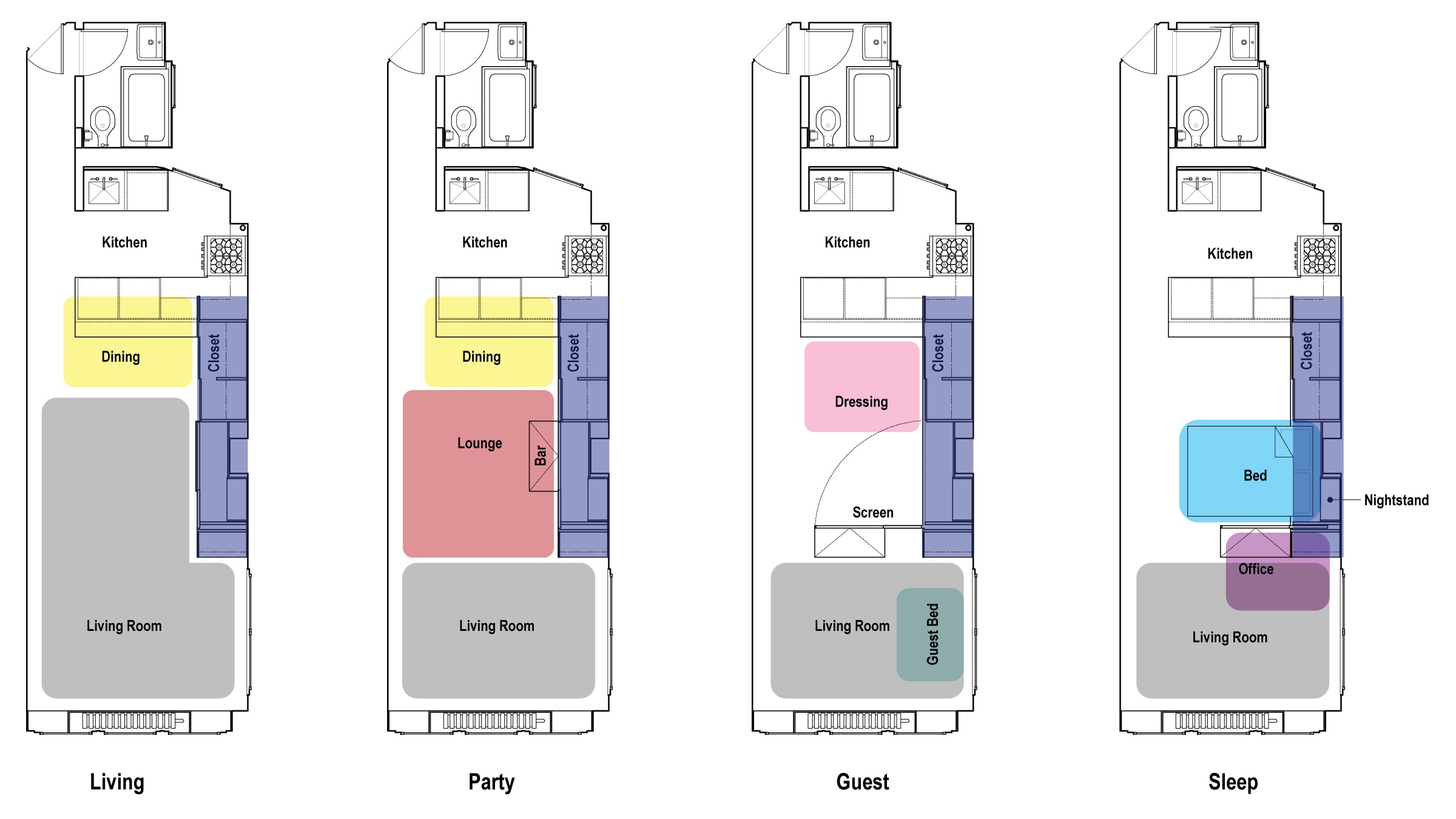
Origami Apartment in New York by Eric Schneider
The bed/living room divider looks a little unwieldy but the result is terrific and there’s even room for guests with plenty of storage space. I especially like the kitchen configuration and lack of visible light fixtures. Checkout this even smaller‘shoebox’ apartment in Manhattan that goes one step further.
Lego Apartment in Barcelona by Christian Schallert
My favourite thing here has to be the way the balcony connects to the rest of the room which all neatly folds away, leaving an empty box. The polished concrete floor complements the warmth of the bespoke wooden panelling and looks easy to keep clean. When things are folded out it starts to look cramped.
Transformer Apartment in Hong Kong by Gary Chang
An amazing amount of thinking must have gone into how all the different components in this apartment fit together with such a high-quality finish. The use of floating walls and mirrors to create separate spaces within spaces is especially ingenious. Smart but perhaps a little over-complicated and fiddley.
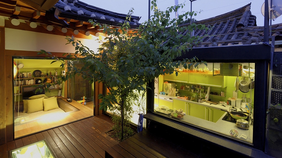
Modern Hanok House in Seoul by Simone Carena

This modern take by an Italian on a traditional Korean Hanok house captured my imagination since it updates centuries-old sensibilities with modern conveniences. An interior courtyard maintains privacy while still allowing light into the building via huge windows and mirrors. More photos here.
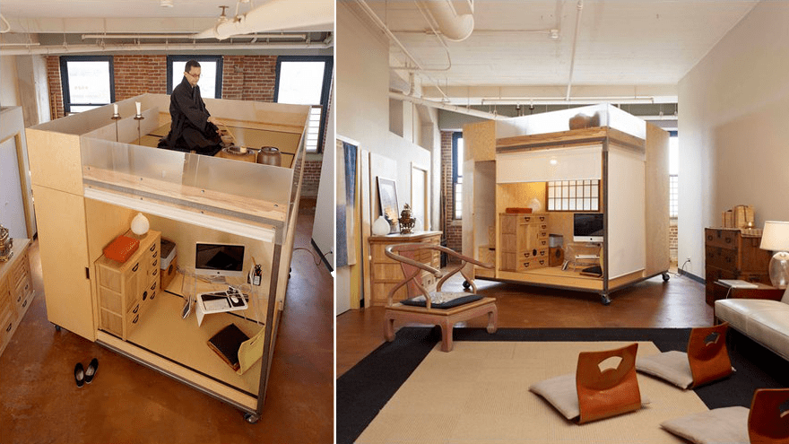
Feng Shui Cube in California by Liu Ming

This “compact mobile dwelling cube” which can be moved around on wheels takes things to a different level with a study, bedroom, and tea room within a tiny box which sits within a large loft apartment. Possibly more philosophical than practical but a pretty cool talking point all the same!
‘Kyosho Jutaku’ Micro Houses in Japan
Many people mentioned Japan as a source of inspiration for their compact designs and the video above gives you some idea of the extremes micro houses have been taken to over there – many sit on barely the footprint of a car parking space! While they may have been born out of necessity, demand for ultra-compact homes, known as ‘kyosho jutaku‘, is apparently rising.
The Potential of Emptiness
The Japanese have a unique philosophical take on the sense of space with its ability to take on multiple forms and thus an empty space is seen to have more potential than a cluttered space. Author and art director of MUJI, Kenya Hara, elaborates on the importance of “emptiness” vs “simplicity” in both the visual and philosophical traditions of Japan, and its application to design –
“The concept of simplicity is only a very recent part of human history in the context of creating our environment… What [the Japanese] found pleasing was a concept of emptiness which is different from the simplicity that was later discovered by Modernism… It seems that being constantly exposed and becoming familiar with various cultures, Japan has actually created a sensibility of ultimate plainness that is liberated from all cultural styles…
In the tea ceremony a principle of emptiness is at work. It serves as a resource of ideas that communicate with and ignites any of a vast range of possible situations, either among people or between the person and the object.
Behind MUJI’s thinking is the idea of applying the simplicity of the products as emptiness… Within the MUJI concept is the idea of discovering within simplicity a luxury that rivals meer appearance.
To create is not just to create an object or a phenomenon. Coming up with a question is also creation. In fact, a question that has huge receptive capacity doesn’t even need a definitive answer… Questioning is emptiness… Emptiness is itself the possibility of being filled.”
You can watch the full and fascinating presentation he gave at Google or again at W+K.

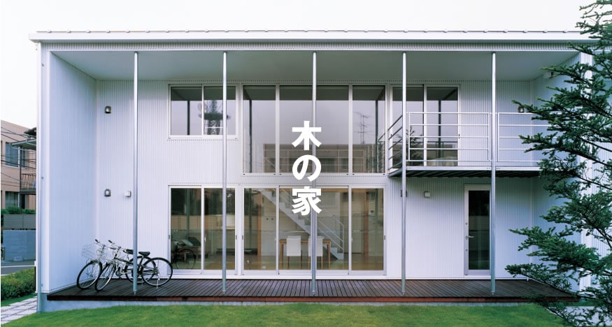
MUJI sells a number of prefabricated houses which are designed to be small but function and environmentally friendly. While “prefab” might be a dirty word for some, these seem to be very well thought through and exemplify the Japanese concept of “emptiness”.
DIY?
Philosophical ideals aside, the core theme when designing for a compact space seems to be creating areas of functional overlap. To live comfortably in such a space careful consideration must be given to ensure that everything is meaningful and has a reason to exist. I can’t help but feel we’d all be a lot happier if we simply had less space to fill with meaningless junk.
While most of these projects have been professionally designed by architects I don’t find them outside the realm of something which could be achievable and maybe before too long, I’ll start putting some of the ideas in my head down on paper. As for cost, that’s an entirely different matter!


Reply