What do you notice about the design of these web pages (aside from the fact that they’re not English)?
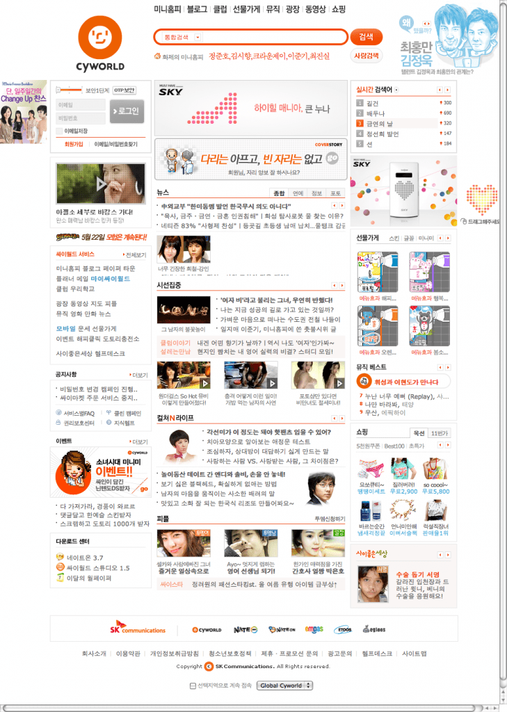
Cyworld 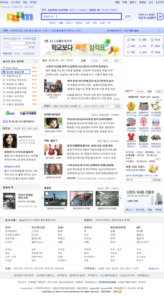
Daum 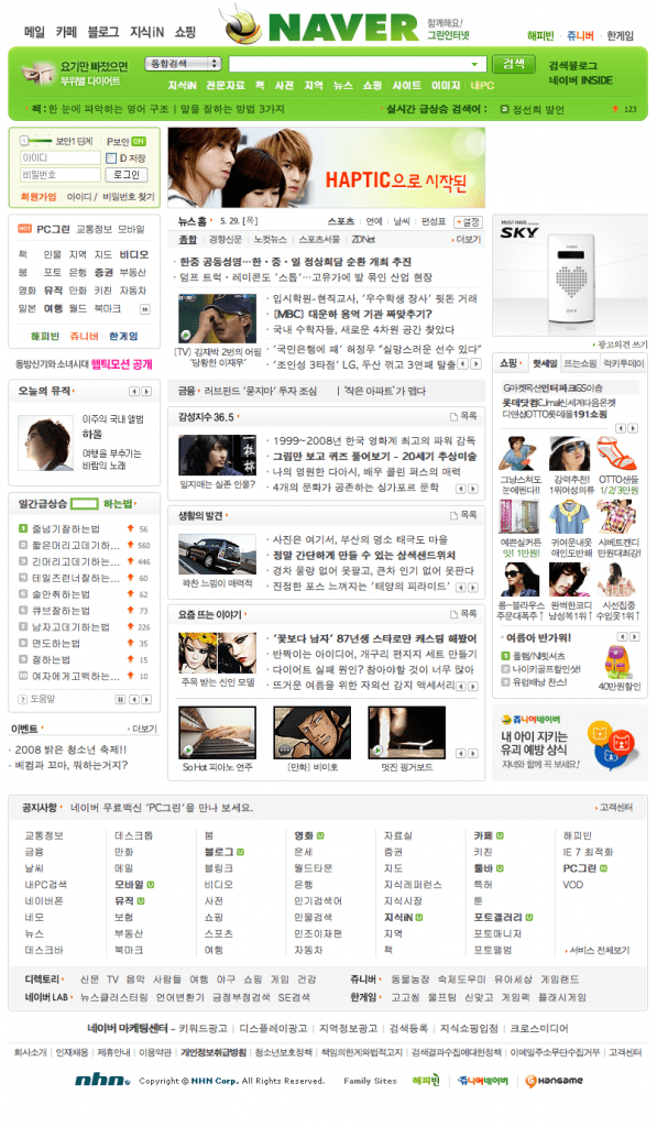
Naver 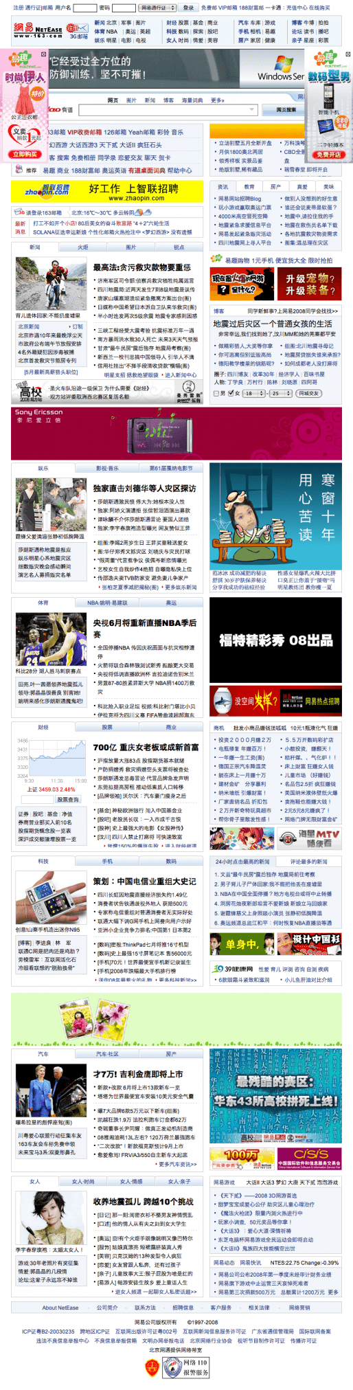
163 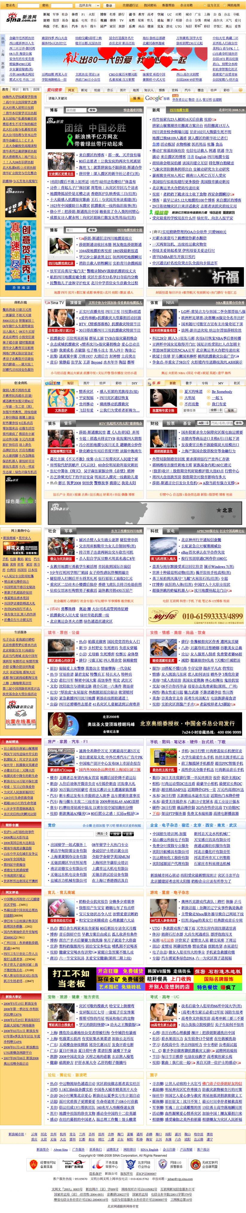
Sina 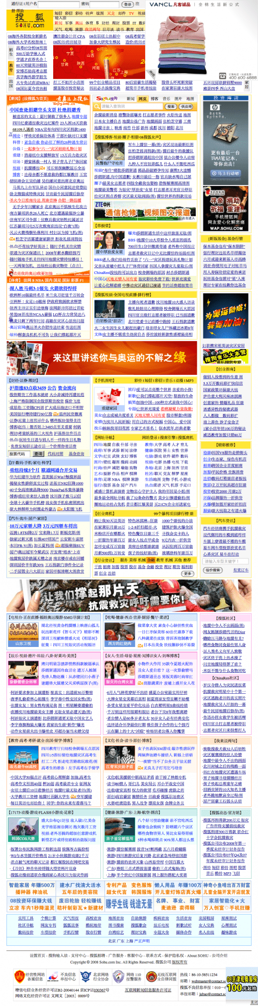
Sohu
The top 3 are Korean and the bottom 3 Chinese – all are popular portals. Naver is Korea’s premier search engine (with 77% of the market there) and Cyworld could be compared to Facebook (with over 20 million users).
If your first reaction is that all these sites are very crowded and densely packed with content then you’re not alone. Your second reaction might be to ask why would they design something so cluttered, and from a western perspective lacking in the clarity and simplicity that we’ve come to expect from “good design”. It’s certainly not very “Web 2.0”, as we know it anyway.
It turns out a lot of other people are thinking the same thing. Different theories for why there is this marked difference are abundant, ranging from the influence of Buddhist principles whereby “strong and rich colour, density, and opulent presentation symbolize happiness and wealth”, otherwise termed the ‘aesthetics of abundance’, to different advertising models and the way in which people read/scan different languages. It seems no one has a definitive answer which means there’s definitely room for research here.
What I find fascinating is that two almost entirely different ways of looking at web design have emerged from a common set of technologies used by different cultures. It’s even more applicable when you consider western firms doing business in East Asia where a simple re-branding exercise is clearly going to be insufficient.

Another interesting point in fact is that whereas in the west we are used to accessing and advertising websites by their URL (e.g. randomwire.com), in East Asia the search box is king and URL’s are virtually redundant. These so-called “navigational searches” may have something to do with the complexities of typing roman characters on input devices specially designed for Japanese/Korean/Chinese but still seems a pretty good idea to me and one which I expect will slowly make its way westwards in time, especially with the rise of the mobile internet where typing is even more cumbersome.
Leave a Reply to Zebra Cancel reply